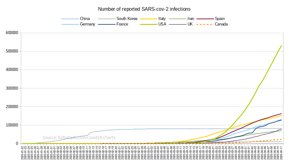
The Y scale is the number of reported infections, on a linear (not logarithmic) scale. Logarithmic scales looked weird to me (at least at this stage of the pandemic), they made everything look insignificant.
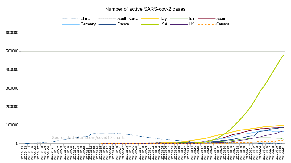
2019-03-30 update: I have now made a new chart type, tracking “active cases” to accurately reflect the situation of countries like China and South Korea that managed to crush the disease:
These charts are maintained by myself as a public service, roughly once per day or two. The primary purpose is to compare the effect of delays and proactive action undertaken by countries to fight the virus before it overwhelms them.
In the interest of public health awareness, you can show/reuse these charts in your articles (you can even hotlink the image src to my server directly; that way, since I don’t intend to change the filename URL when I update, your website always has the latest version). If you do use my charts, it is nice to also link to my page as a courtesy and as a way to cite your sources.
Why these charts? Why those countries?
I made these charts because I was annoyed that I couldn’t find anything like this (i.e. a combined single view of the historical outbreaks of China, South-Korea, the major “early-infected” European countries, and North-American countries)… All I had found were either “historical charts for single countries”, or “dashboards of multiple countries that only show the current status”, or charts that were behind some stupid newspaper “paywall”. Since I’m available for hire, I had some spare brain cells to dedicate to this.
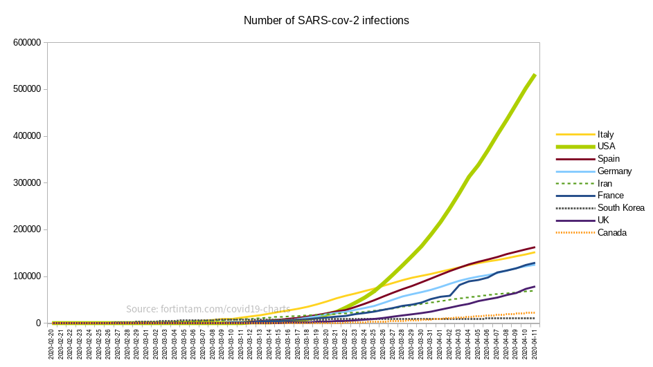
My charts were also a small part of the support materials in a short documentary video I have made, where I analyze and explain in detail why the U.S. is such a special case compared to Canada, Italy, the UK, etc. (if you watch my video, watch it until the end, it’ll be worth your 20 minutes of attention):
This is the chart I published on March 23, 2020 when I made my video:
Why did I pick this particular choice of countries? Well, mostly the countries that had the earliest and biggest outbreaks, but also Canada is interesting to look at as a potential outlier, because it has the same kind of “delay” as the USA but a very different social safety net (fairly similar to Western-European countries) and a much more proactive governmental response (that’s, eh, a very polite understatement), particularly in the province of Québec.
Sources
I get my data from the WHO, the John Hopkins University CoViD-19 dashboard, multiple Wikipedia pages, etc. It’s usually not possible to be absolutely 100.00% accurate on numbers of the “current day” because the information from each country comes at different times of the day, and sometimes they revise their numbers up or down, etc. Sometimes I have to make a judgement call because some sources have divergent numbers. But the error margin is small and it’s a pretty good general overview anyway.
Future updates
I’m not sure how the situation will evolve as time passes, so I may need to make additional charts (and/or videos) in addition to the above. We’ll see.
If you want to be notified of major updates, whether about this page, or new videos or about new articles on my blog, you can sign up to be notified via email with the form below. I typically post only a few times per year, so you won’t get flooded.
This email notification list is private and owned by me as an individual, and I am not selling your info to anybody. See also my super amazing privacy policy if you care.
“But Jeff, why the hell would I want to sign up to your personal mailing list”, you ask? Well, if you are curious about that, you can get all the details and context here (in short: it’s simply for your convenience, there’s no catch. I enjoy knowing that people are interested in reading or watching my content).