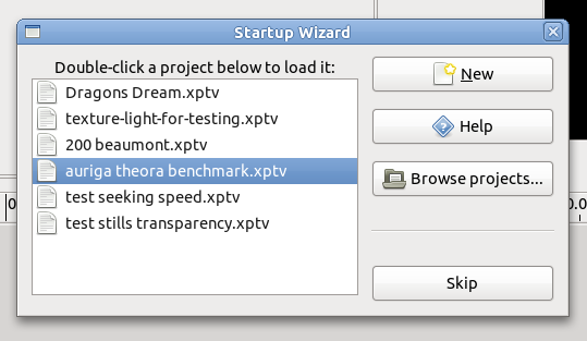
Part of the PiTiVi Love list, Mathieu Duponchelle has implemented a “welcome screen” (also known as “Startup Wizard”). It is a great little feature which uses GTK Recent to automatically show the last few projects you were working on, so you can open them with two clicks (or by pressing Enter):

You wouldn’t believe how often I start-up PiTiVi and load the same projects over and over again for testing. This feature, now merged in the main development branch, makes my job easier.
I carefully designed this dialog so that it made the workflow more efficient, not less (unlike some “stupid” wizards I’ve seen over the years). It should really have been named an “Assistant” or “Welcome” screen, because it’s not a linear druid/wizard. I would personally not have included a “Skip” button (see the bug report for the reasoning), but hey, we’re not that short on space (and this button will probably prevent me from being assaulted by angry geeks).
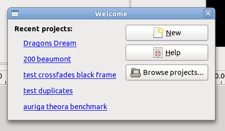
Update: I have made an attempt at an alternative implementation here. It looks like this:

It solves some problems (you don’t need to double-click anymore), but I can’t figure out how to sort by “most recently used” (RecentChooser has a method for it, but not RecentManager doesn’t). Sorting manually in another loop sounds like a performance disaster. And frankly, I don’t know which looks better anymore: the linkbuttons approach or the recentchooser widget.
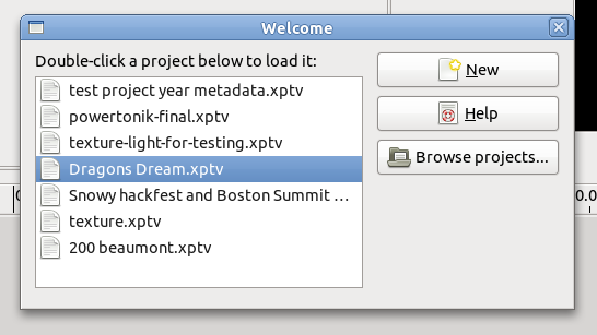
Update2: a blend of the two (probably what will happen):

Stay tuned for some very interesting features that Mathieu has been working on lately…
Comments
16 responses to “Startup Assistant1 min read”
This would be much nicer as a full widget like Monodevelop’s welcome, vs. a dialog.
Couple things,
“Skip” seems unneeded if there is the ability to open or create a new project.
I think that means you can get rid of the hseparator too.
The buttons have quite a bit of spacing. i think 6 px would suffice.
The “double-click project ..” title is centered and doesn’t really fit. it should probably be left aligned and bold. (id suggest changing the text to “Recent Projects“). Also, if you have to tell a user to double click, i think there is a bigger problem.
Help should be on the left-hand side of the dialog at the bottom, it has nothing to do with the others.
On the right hand side at the bottom could be a “Continue” button or something.
Either way, the button box on the side should be aligned with the top of the treeview, not the title.
hopefully nobody takes offense to my contructive criticism, i only mean to help. point being, while the functionality seems nice, the dialog could use some touchup.
just a quick example: http://x.dronelabs.com/chris/dropbox/ptvidea.png
here is an idea im going with for perfkit, that i think is a bit easier for first time users. (previous sessions would be listed on the right and would show a screenshot when selected). http://x.dronelabs.com/chris/dropbox/welcome.png
HTH,
— Christian
Carefully designed? What’s the purpose of that groove above the skip button? Why don’t you bottom-align the skip button with the recent files box, and similarly for the new button to be top-aligned with it? Why is the help button between new and browse? And why is the “double-click […]” text centered instead of being left-aligned?
@Everyone: you basically just described exactly how my mockup was (how I actually designed the thing): http://bugzilla-attachments.gnome.org/attachment.cgi?id=170388
The implementation was different from it. And when it was merged, it was made even more different.
I thought it was “good enough” (didn’t want to have the patch sitch in development hell), but if there’s more than just my voice on this, I guess it could justify having me come up with a patch to make that dialog fit 1:1 with my original requirements.
Again, I’d prefer
– left-aligned text. But I do think “double click to…” is needed and does not cause any problem. It’s not like we could simply open the project on single click, that would seem a bit dangerous to me.
– remove that separator (when the hell did it show up?!)
– maybe no icons, but not 100% sure about that
@mmc: why is the help between New and Browse? Because New and Browse are the most frequent/probable actions. See http://library.gnome.org/devel/hig-book/stable/windows-alert.html.en#alert-button-order
By the way, “careful design” is more than just minute details like spacing and alignment (which are important, but still). See the workflow discussions on that bug report.
Nice, i really like the idea 🙂
And i really really like Christian Hergert’s mockup : looks crystal clear to me
Once bug 630751(presets for for rendering) is fixed, PiTiVi will be very user friendly
The problem I see with Christian’s mockup (2nd screenshot) is that, although it is prettier/shinier:
– It eats lots of space. For some strange reasons, some of our userbase wants to run Pitivi on netbooks 🙂
– It requires more clicks to open recent projects. My approach dumps them directly “in your face”.
“It eats lots of space. For some strange reasons, some of our userbase wants to run Pitivi on netbooks :)”
I don’t think that wizard window eat more space than PiTiVi main window tehrefore it should not be a problem
“It requires more clicks to open recent projects. My approach dumps them directly “in your face”.”
Speed is not only a matter of clicks ; your approach requires more thought as far as i’m concerned
The “Double-clic a project below to load it” looks like a workaround to me whereas Christian Hergert’s mockup doesn’t need that
You shouldn’t need to tell them to double-click; if they figure it out, good for them, that option is available, regardless. Either don’t tell them and replace the skip button with a continue button, or tell them and drop the skip button (it’s redundant anyway, with the new button; may cause confusion, will cause pause for thought).
Get rid of the horizontal separator–the vertical space is more than enough of a separator without you (rhetorical) adding your own, and the visual separator grabs the user’s attention, slowing him down. (of course, if it wasn’t vertically centered, then it might not be so bad…but it’s not)
The name is a poor choice, as it’s more a startup screen/assistant, as you said.
Basically, I agree with your mock-up ~100%, except I like the list view better than the links, but that’s more a personal preference; I never really liked the idea of links in a program UI, especially colored blue and underlined, as if they were in a browser and against a white background (they’re not, in case you forgot 😉 ).
nekohayo : about the “Double-clic a project below to load it” advise, remember that once you pointed out to me the “users don’t read dialog boxes” Joel Spolsky’s paradigm 😉
Why not copy Brasero? Make the wizard not a separate dialog but part of the main window. When you click on it simply replace the contents of the main window with the regular PiTiVi interface.
I made a different implementation with linkbuttons instead of the recently used widget. While I was at it, I also solved most of the spacing/alignment issues and killed the Skip button and the separator. See the updated blog post above.
Would it be possible to see a screenshot please ?
@antistress: scroll up 🙂
the RecentManager class is the model. sorting is done by the RecentChooser interface implementations.
I don’t like the new iteration since i don’t understand the point of having links.
It seems confusing to me.
Christian Hergert’s mockup seems the best to me (clean, simple, understandable… obvious).
Maybe you could take the Christian Hergert’s mockup and add the ability to double click any item of the list (as well as using the open button) ?
Maybe that would please everybody ?
I like this. I think Christian Hergert’s mockup looks like those irritating startup assistants/wizards that exist in other programs. Needing extra clicks, looking too big and intimidating when I just want it out of my face.
I hope you don’t show the assistant on first use (when there is no saved projects)? No use showing it then. Then it’s just a hinderance to get where we want.