Okay, so GNOME/GTK+ doesn’t show icons on buttons anymore unless they are part of a toolbar or you specifically request that they show up. The problem is that because of this, PiTiVi’s play/pause button would end up not showing anything at all. Thus, back then Alessandro inserted this piece of code to force displaying icons on all buttons in PiTiVi.

Being willing to forego my initial disagreement with GNOME’s decision to remove button icons, I’ve been revisiting this problem recently in the hope of better integrating with the rest of the desktop. The problem remained, however, that simply reverting that commit would leave me with some broken buttons in PiTiVi such as the play/pause button and the “clear” buttons in effect properties or the preferences dialog, so I set out to fix that.
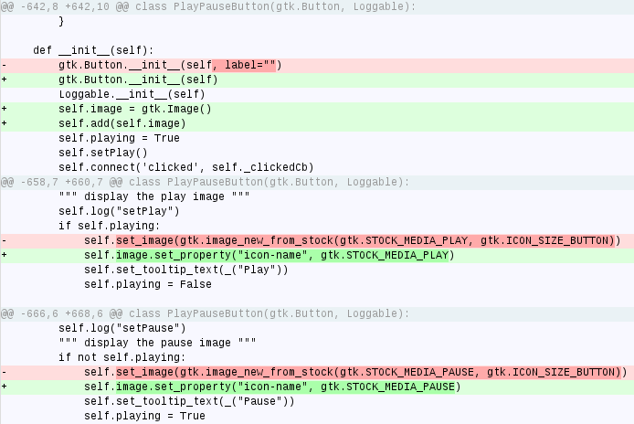
Except that my fix for it seems like an ugly hack. This is what I attempted at first:

But then I ran into some sort of silly bug where:
- The “play” icon would not show (I triple-checked the stock icon name, my icon theme, how I was calling it, etc.). Instead of the “play” icon, I’d get the dreaded “image missing” icon.
- The “pause” icon would show without any problems.
- What was even more puzzling: using the “stop” (“STOCK_MEDIA_STOP”) icon instead of the “STOCK_MEDIA_PLAY” icon would work fine.
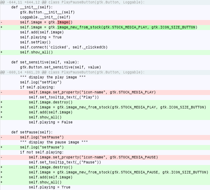
I ended up finding a way to do what I wanted, but it looks like a stupid hack to me:

Destroying and recreating icons every time? Is there really no better way to do it?
Having been unable to find someone to answer this nerve-racking question on IRC, I now turn to the collective wisdom of the Planet to point out whether or not I’m Doing It Wrong™ and if there is a more elegant way to achieve these results. How would you do it?
Comments
9 responses to “I really want to show icons”
I solved this in Stoq a couple of weeks ago, this is what you need:
# Creating a button as a temporary workaround for bug
# https://bugzilla.gnome.org/show_bug.cgi?id=632538, until gtk 3.0
gtk.Button()
settings = gtk.settings_get_default()
settings.props.gtk_button_images = True
You are using a stock name as an icon name. (not the same)
self.image.set_from_stock(gtk.STOCK_MEDIA_STOP, gtk.ICON_SIZE_BUTTON)
should work.
Your solution is a little ugly, but it doesn’t sound inappropriate. The default button is a text label, that may or may not have an image to one side. But you don’t want a text label at all, so replacing the button contents entirely sounds to me like the correct thing to do…
@Johan: that’s actually exactly what the commit from 2009 (the one I want to revert) was doing 🙂
@Christoph: damn! Your solution does the trick! Thanks a lot!
I know that this is getting into the field of design instead of code, but one could argue that the question is already wrong. There is a debate in the GNOME community if this kind of image changing is appropriate.
The HIG clearly states: “Do not change Play to Pause while the clip is playing.” I’d go with them at this point. Instead, they propose: “Show separate Stop and Pause buttons.” This is what I probably wouldn’t do, either. Rhythmbox uses a ToggleButton, and so do I with Transcribe. I think this is a clean solution, as the button actually behaves like a toggle. But other people disagree, including the Totem crowd.
@Frederik: The HiG is also a set of *guidelines*. If I had to pick 1 and only person who knew the HiG pretty well off the top of my head, it would be nekohayo.
@Frederik: I will change this to a togglebutton if Totem does it too. At the time being, the case of the Play/pause buttons is one of those gray areas in the design of the GNOME desktop, even with the quote above from the HIG.
Also, every other video player and most of the music players I’ve seen so far use a two-state button instead of a toggle or using two separate buttons. I’m going with the most common denominator for now, but if there are *many* people disagreeing with me I could simply make it a toggle button.
@Jeff: I know they are guidelines. That’s why I also wrote that I personally wouldn’t go with the proposed two-button-thing. I just think that one should have good reasoning why to not go with the guidelines. But this might well be the case here.
@nekohayo: Yes, it’s clearly a difficult area. And it’s quite confusing to have the two major media players (Rhythmbox and Totem) disagree on this. Personally, I think that a ToggleButton makes sense as this is what you actually do: You toggle the state, even if you do this by changing the icon instead of using the built-in method. But there are good reasons to decide otherwise.
Sounds like the “always-show-image” property:
http://developer.gnome.org/gtk/2.24/GtkAction.html#GtkAction–always-show-image
http://developer.gnome.org/gtk/2.24/GtkImageMenuItem.html#GtkImageMenuItem–always-show-image
But I don’t know how this is applicable to GtkButton.