If you’ve tried rendering projects with Pitivi 0.15 or older, chances are you’ve encountered one of these dreadful situations where the rendering process would get stuck:
- …at the beginning, with the progressbar saying it’s currently “estimating” — which was a lie that I corrected a little while ago.
- …at the very end. Extra trolling points for having made you waste a huge amount of time to get a 0 bytes output file (if we’re lucky, that bug is gone).
- …somewhere in the middle, because caps negotiation failed, some elements were not linked, GStreamer thinks you ran out of available RAM, or because you’ve been very naughty.
In any such case, the rendering dialog just sat there and smiled at you, as if everything was fine in the world. Well, no more:

This is the result of a horrifying thought suddenly springing to my mind yesterday night: “Hey, what if the code was not even checking for errors in the pipeline when rendering?”
Indeed, it wasn’t. How silly is that! I have thus prepared a simple fix to improve the situation: catch pipeline error messages, abort the render (you really don’t want to ignore a GStreamer error) and display an error dialog. This will at least let people know that something is wrong and that they should start writing patches to GStreamer instead of accusing Pitivi of hurting kittens. You’d be surprised how many people can sit for hours in front of that stuck progressbar.
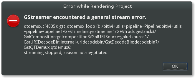
Before I commit the fix however, I would need your feedback on the usability of that dialog:

This is not terribly pretty, but it’s better than nothing. A few things to consider:
- In that screenshot, all the text except the window title (“Error While Rendering Project”) comes from the GStreamer pipeline error message (the error and the error’s details). I know that the error details look ugly, but I suspect it wouldn’t be useful to GStreamer/Pitivi developers if we don’t have them “verbatim”. Maybe we could try to mangle the error details string (split using “:” and take only the first and last two items of the resulting list?) and encourage the user to run from a terminal to get better debug info, but that feels a bit backwards.
- We should probably have some less-scary text to accompany the actual error details. Something that guides the user towards an action that can be done to address the problem (ex: reporting a bug). Maybe it can be placed between the header and the details (above the “qtdemux.c” line)? The problem is finding a universal text to be used.
- If we consider the route where we suggest the user to report bugs, where should we point to? The Pitivi bugs investigation page? Pitivi bugzilla? GStreamer bugzilla? The distro’s bug tracker?
- Let’s keep this simple, both visually and in terms of code/implementation.
What do you think? Is the current approach sufficient or is there something better that we can easily do?
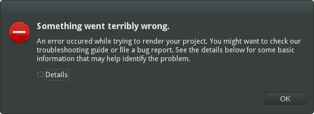
Update: here’s an alternative dialog with some more comprehensible text, where the actual error (as seen in the previous screenshot) gets shoved under the rug by putting it in a GTK expander widget (clicking “Details” reveals the error’s details as above):

Comments
13 responses to “No more stuck rendering dialogs!”
How about showing only a friendlier but less useful message by default, and hiding the GStreamer error behind a “Details” button to expand the dialog to show it?
Yes, I thought the same.
What about:
Title: GStreamer encountered a general stream error.
Text: PiTiVi was not able to render the project. You might want to try again, or file a bug report.
Expander: Details → Error text
I guess the pitivi bug tracker would be a good place to point to, and the pitivi devs could re-assign this to GStreamer if it is a low-level bug. But since I am not that familiar with your bug handling workflow, there might be better ways.
That error dialog is horrible. We should ideally never show that to a user. It’s not even a proper error message, it’s what GStreamer gives you if things failed so badly that there is not proper error message. The only reason you’d ever show it to a user is because it’s “useful” and they can copy’n’paste that into a bug report instead of having to take extra steps to extract the info.
The title is bad and misleading too. Often these errors happen because of something the application (or another library it uses) have done wrong, it doesn’t necessarily indicate a bug in GStreamer.
Any bug encountered whilst using an application should usually be filed against that application, so the application’s developers can investigate it and determine if it still applies to the latest version of their software or their dependencies, and figure out who’s at fault. They can then send the bug towards the lower layers after having reproduced it with the latest and greatest, and possibly narrowed it down even.
I second the “details” expander movement.
I’d also replace the “forbidden” sign with a sad smiley, to show empathy with the user, i’t a tiny detail but I think it would help.
I tried implementing the use of the “sad-face” icon in a simple way, but the problem is that GTK Image’s new_from_icon_name makes it impossible for me to know if loading the icon failed or not (because it will display a “broken image” icon instead, and the return value is always True)… and I suppose I can’t assume that this “sad face” icon would always be present on users’ computers (especially outside gnome). So I have three choices:
Implement something rather complicated and ugly for this specific case– not even sure that’s possibleAt Jokosher we are using GtkInfoBar (well, at least in my branch) to show this error at the bottom of the main window (not in classic modal window style). Besides that I think good balance would be:
1) Saying user what matters to him (unfortunately there have been a bug, if you can, please copy/paste additional details in bug report here, etc.);
2) Giving additional details trough another dialog window (as suggested) or just extending current window;
If there’s specific cases which we can detect when we get error from bus (like something missing in installation, etc.) give user more concrete message so that user can try to fix it.
Is there a way to link this into distro specific error handling, so that the various bug handlers can allow easy bug reporting? the specific gstreamer error can be part of the usual ‘stacktrace’ portion of the report (developer friendly), the error message could be changed to something more generic (user friendly) to the user (like Error rendering video) even if it is less useful, and maybe more data could get spit up with the stack trace?
I updated the blog post above with the screenshot of a revised implementation that provides a slightly less ugly and demoralizing text for users… let me know if that’s indeed better.
Yes, that is indeed better!
I would, however, second two suggestions:
+1 for the reformulation suggested by tim, and +1 for the sad smiley suggested by Ulisse. Both make it yet a little less scary.
How about “Sorry, but something didn’t work right” or “Something unexpected happened”. “Has gone terribly wrong” might sound a bit alarming for a novice user (who might not understand that it’s not to be taken entirely seriously and their data isn’t affected).
Fair point! I think your first suggestion sounds interesting to me (a little bit less formal without mocking).
The detailed error message is useful for two things: the user can copy/paste to file a bug report, and the user can google for help. How about instead of making them do all that work, instead just have two big helpful buttons that do these things: “File report” and “Find help” or something like that? I would probably still include the expander in case there’s something I didn’t think of, but if you’re going to go halfway and give the error to the user, why not go whole hog and help them use it effectively?
Hmmm… partly because
So yeah, the thought has crossed my mind but I’m not sure how to handle it (and I want to keep the implementation relatively simple too 🙂