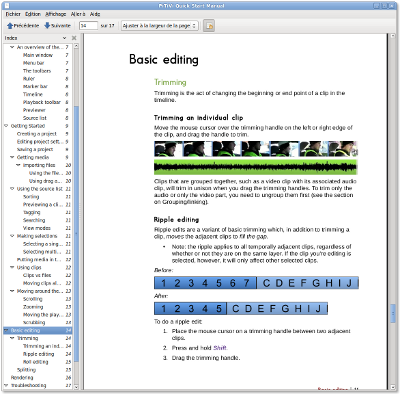
 I have spent approximately 15.6 hours (in the past week or so) writing a new user manual for PiTiVi. By hand. With a pen and paper during boring meetings. And then converted it to the digital medium with my awesome dvorak typist skills.
The result can be seen in PDF here as a preview (temporary place). The source file is also available if you want to make some extensive edits.
Please take a look, provide suggestions/comments, etc. This manual is geared towards PiTiVi 0.13.2 rather than 0.13.1, so it even documents nonexistent features (such as tagging/filtering in the sources list).
I typeset it using OpenOffice Writer, because:
- I want a manual that looks good, modern, professional, unique. So far, the best-looking software manuals I’ve seen are monolithic PDF files.
- I’m much, much faster and efficient with Writer. Hey, if I could typeset a whole 10-20 pages journal in an hour with it, it sure isn’t so bad?
- LaTeX is not an option. I don’t want to fight with it. This manual is too design-centric.
- Docbook gets in my way (much more xml tags than contents!), and, so far, the manuals I’ve seen in GNOME apps feel a bit… odd. When looking at them, I somehow get lost, I don’t feel a clear sense of hierarchy or chronology/gradual learning. That’s subjective of course. Maybe I just didn’t spend enough time actually using Yelp. Maybe I’m crazy.
Anyway. Take a look at this manual. See if it’s any good.
Latest posts by Jeff (see all)
Comments
7 responses to “PiTiVi manual”
I’m suprised by how good it looks given that you used a word processor. Very cool, and good work for Pitivi.
Thanks 🙂 leveraging the power of OpenOffice’s “stylesheets” (the stylist) makes all the difference in writing something with a coherent/consistent design.
i want to read it i just need to find the time to do it :-/
i’ve finally read it and it’s a good work
i just wait to see next pitivi releases now
1°) The difference between project setting and rendering setting is unclear to me
i don’t even understand why we should adjust project setting
Gstremer is able to recognize any file and to deal with it
only the rendered file has to be set
2°) ni icons in toolbar for ripple/roll editing ?
http://help.adobe.com/en_US/PremierePro/4.0/WS1c9bc5c2e465a58a91cf0b1038518aef7-7d32a.html
http://phpbb.ulead.com.tw/EN/viewtopic.php?p=72391&sid=a10595d350d6df5d7828d65c1ee66dc5#72391
http://www.geniusdv.com/weblog/archives/trimming_tools_for_final_cut_pro.php
3°) U should make an html version of it that could sit in the Help menu
1) me neither. The useful function of project settings is, for me, to have the proper previewer ratio/resolution while editing, and setting the default codec settings used (but I did advocate for those to be only in the render dialog; by doing a mockup for the render dialog, I also did a mockup for the project settings; see http://bugzilla.gnome.org/show_bug.cgi?id=432723 )
2) yeah, they are fugly and don’t represent much, but then again, ripple/roll edits are a very abstract concept. But if we do need icons, I could take inspiration there.
1)° maybe for smart rendering ?