I’m currently in Málaga for the GStreamer hackfest. Hopefully, many bugs will perish. In the meantime, here’s a quick status update of stuff I’ve been doing in recent times in Pitivi.
- Cleanup the code for gtk actions so that the code is more readable and robust, fixing 629208 in the process.
- Cleanup the menus (again).
- Avoid having the viewer eating the CPU while idle.
- Fix various problems such as “Select unused clips” not working in treeview mode or reimplement removing all timeline instances of a clip when removing it from the media library.
- With the help of Brian Grohe, merge and delete spam user accounts on the wiki. I only have to fix image uploads and the https certificate issue now.
- Start fixing 629855; see below for details.
It turns out that pitivi was secretly writing autosave/backups of your project files (and deleted them when successfully saving/closing), but it did not actually use them. You’d have to know they exist, when they exist and where to find them, which is hardly intuitive.
So, I set out to fix this. Along the way, I ended up making the “unsaved changes” dialog more helpful. This is the result:

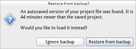
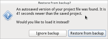
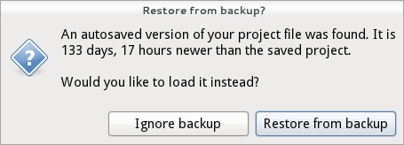
Then I worked on the actual dialog to prompt the user about the existence of an autosaved project file. It uses uses the same mind-blowing human-readable time formatting nekohayan technology, as you can see in the various following scenarios:


If you ignore the backup file, it will obviously be deleted when you cleanly save/close the project.
The big question is however, what we should do if the user selects to restore from backup:
- Should we simply rename the backup file to overwrite the “old” project file and then load it? This would mean the “old” project would be lost. In theory nothing should go wrong with that…
- If we want to be paranoid perhaps we could load the backup file as a temporary file and force the user to use “Save as” instead of a regular Save, but I’m not sure if that’s what users need. Thoughts welcome on this one, but I’d really like to have a simple solution.
Comments
9 responses to “Restoring from backups”
You could show a Save As dialog immediatly after clicking Restore from backup.
It would be nice if a summary of changes between the two were displayed. Otherwise, the user is probably just guessing.h
If the user clicks on “Save”, it should bring up a dialog similar to the restore one, warning that we’re about to overwrite an existing project with the version restored from a backup, and offer to proceed saving, cancel or save as.
One thing I’ve been wondering about is treating a project like a source code repository. With that in mind, you need to think about all the operations you do kind of different
file => repository
open => clone/checkout
save => tag
undoable action => commit
undo => revert
The only thing you need for this is a way to store the data of your repository in a way optimized for this kind of working. But I think the Pitivi save files (not including the videos the project uses) are small enough so that this is entirely possible to implement.
With such an approach, this problem of deciding between the two versions – which one to open and which one to delete – would become a lot less problematic, because there would be nothing to delete. You’d basically just do a checkout of the version you wanted to work with, and the other one would live on as a branch somewhere.
And once you have a data storage implemented like this, you can implement diff and patch operations. And once you have that, you can go crazy and implement rebase, branch and merge. And then all you’re limited by is the UI. And if you don’t believe me that’s reasonable, go and watch http://www.youtube.com/watch?v=RBL1cVzIQik :p
Considering Bug 608108 – unsaved changes dialog should be more informative :
Knowing the time at which the file was last saved is indeed useful
However the dialog box is cluttered and i don’t feel comfortable with it : too much choice to be at ease i guess. Do we really need 3 buttons ? it took me long minutes to understand the meaning of the whole thing
Looks great.
Nitpick: I believe your Restore from Backup alert slightly violates the Gnome HIG:
http://developer.gnome.org/hig-book/3.0/windows-alert.html.en
(It shouldn’t have a window title, the current window title should instead be formatted as the primary text, and the question at the end should probably not be there.)
Rather than specific times, why not fuzzy it to make it more human?
* Less than a minute
* A few days
* Almost a week
* A few weeks
* Just over 3 months
* Almost a year
* Over a year
etc…
This kind of stuff gets pretty complicated pretty quick. If someone comes up with an implementation/patch for it that’s cool, otherwise I’m not sure it makes sense to spend so much time on a friggin save confirmation feature 😉
Reimplementing a VCS/”time machine” with full graphical comparisons between project instances is a bit of an overengineered solution. Well, in theory it’s really nice; in practice, I’d rather fix bugs in the actual software (there’s a reason why this is not the standard behavior of all desktop apps out there 😉
@Antistress:
Yes. You need that Cancel button. What happens if 1) the user is unsure of what he wants to do and wants to go back to check out the current project before deciding, or 2) the user wants to “Save as” rather than overwrite?
They are already fuzzied a bit, but I think that we don’t gain much clarity from fuzzying them even more. Also, my example screenshots were a bit extreme: it is quite rare that someone would have a backup file that is significantly newer than the project file (unless, like me, you have read-only xptv files used for testing that are many months/years old).
I think the simplest and safest bet for now will be to force “Save as” the next time the user clicks on “Save” (this is what my revised implementation does now). Hopefully this should do the trick. Thanks a lot for the feedback/ideas, folks!