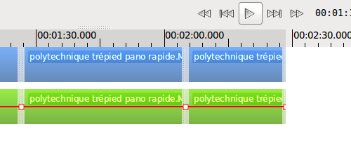
Edward released PiTiVi 0.13.3 today. Brandon recently spent some time working on the timeline’s ruler, and his changes are part of that release. So now, it looks like this:

What’s the difference, you say?
- It looks slightly better visually;
- The timecodes are displayed/managed in a smarter way;
- The “ticks” are now on the bottom of the ruler;
- The ruler now uses your GTK theme’s colors.
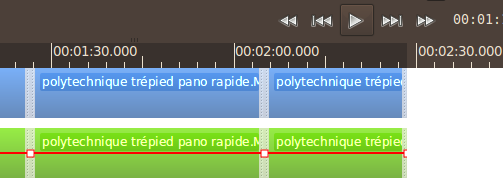
So when you use a dark theme (in this case, DarkRoom), it looks nicely integrated:

But wait, this is not all. New functionality was added too. If you zoom in enough, you can see a representation of the project’s frames (the alternating white and gray zones):

Latest posts by Jeff (see all)
Comments
One response to “Themed ruler widget in PiTiVi”
rien que les chiffres indiquant la durée sont plus lisibles