 I once wrote a nice rant about the inadequacy of the desktop metaphor.
In the light of the upcoming GNOME 3, the more document-centric Shell and the browser-mode nautilus (instead of spatial mode), I wanted to remix my thoughts a bit.
Note: I am not a developer and I am not on the Shell or Nautilus teams. The idea of a desktopless environment was briefly raised on the Nautilus mailing list months ago and has hesitantly appeared at the end of the GNOME Shell Design Document, as quoted below:
Used for both ephemeral, and working set data finding and reminding. Given time, the constant stream of things to do, the constant remainder that does not get done, and the unwillingness to categorize and archive manually, and the fact that the solution doesn’t scale (due to being spatially bound) results in the system breaking down. On top of this – so to speak – is the problem that this data lives underneath all of the current activities on the computer and is therefore very difficult to reach. Which also tends to reduce its effectiveness for finding and reminding. It also doesn’t provide any form of prioritization.
In the Shell design, the “desktop” folder should no longer be presented as if it resides behind all open windows. We should have another way of representing ephemeral and working set objects.
The reminding function of the desktop is really only available immediately after login. Once any activities are started its effectiveness is dramatically diminished. Starting the Journal automatically at login will have a equivalent effect and have the advantage of being easier to access later.
However, I haven’t seen much more happening since then, and I believe this to be a fundamental question to settle. GNOME 3 would be, in my humble opinion, a perfect window of opportunity for an “intrusive” paradigm shift like killing the aging desktop metaphor.
I believe the concept of “icons on the desktop” to be counterproductive and perhaps counterintuitive. This blog post is a humble attempt at demonstrating why.
Windows obfuscating contents
Most of the time, the desktop is hidden by multiple windows. To access your desktop contents, you need to manually minimize your windows, hit Ctrl+Alt+D, or use the “Show desktop” panel applet (which probably won’t exist in the Shell anyway). Then, when you are done interacting with your desktop, you need to raise all your windows again. You keep moving things out of the way and putting them back in the way, all the time!

Alternatively, you could use nautilus to access the contents of the desktop folder, which defeats the purpose of having contents on the desktop. Or you could always keep an empty virtual workspace to switch to, but it quickly fills itself with windows and the cycle repeats itself.
Icons, visual clutter and cognitive strain
The Desktop is typically “designed” for transient files (though, as I’m arguing here, the vast majority of users don’t actually use it for its intended purpose). By transient files, I mean the following categories/scenarios:
- Files that I received or downloaded (through instant messaging, or files that the web browser auto-downloaded for me, for example)
- Temporary crap: blogging material, files to be attached to bug reports, files from bug reports, emails, etc. Usually files with a lifespan of five minutes.
- “Reminder” files, there just to annoy me into doing something about them.
- Files that I am currently working on (though, in theory, nothing prevents us from working on files that were already filed properly in folders)
- Files that are “waiting” for something (for example, files I would need for project X in 2 months)
The distinguishing lines between those scenarios is often blurry, to say the least.
The problem with desktops is that we, modern “information workers”, have heaps of data to process, and we have the following choices to make about a file (GTD/Inbox Zero fans will see that one coming):
- Process it immediately (and then delete or archive it)
- Defer it (“I need to wait 2 weeks for event X to happen before I can touch this”)
- Archive it (in that case, it should not be on the desktop)
- Get lazy and let it sit there
Oftentimes, this means items start accumulating on the desktop for weeks on end, waiting for the right moment/motivation/energy to be used. All this has a price. For some, it can be annoying to have all that stuff in your face all the time, or it can become a chore to “clean up”.
Ironically, the inverse tendency can also be true: the less there is, the more we are inclined towards piling up new stuff.
Keeping the balance takes determination and technique (not everyone is a GTD/Inbox Zero maniac). For less organized people, the desktop just becomes a dumping ground, full of “stuff” constantly in your face, “urging” you to be processed and reminding you that you should be doing something else but don’t have the energy or resources needed.
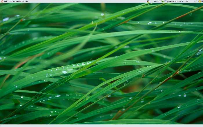
My point is a bit hard to prove here because, to some, it may look like I am advocating “hiding stuff under the rug”. For the sake of the argument though, I shall say that I have been running my computers without a desktop since 2007. This is what it typically looks like:
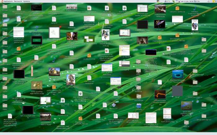
And this is what happens if I reactivate the “icons on the desktop”:
As a real world analogy, my current summer job involves office work. Pure, old-fashioned office work with actual folders, tons of paper, a hole puncher, stapler, and pencils. I process a couple of dozen cases per day, which means that my desk is a constant mess, with me pushing and pulling folders around, using aforementioned tools, throwing them back in the pile while I go fetch printouts, letting objects fall on the floor, leaving bits of memos everywhere, etc.
It doesn’t look exactly like this, but close enough:
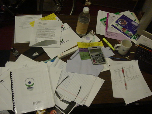
(picture by Rob)
It is Hell.
Why would I ever want to reproduce this kind of chaos onto my computer screen? Isn’t it the computer’s job to give me unlimited storage and triaging capability for me not to shuffle things around constantly?
Text legibility
Partly due to Bug 317764, GNOME’s text readability on the desktop is very poor, to put it nicely.

As I don’t want to nitpick on a bug report that I filed years ago, I won’t comment further on the matter. Suffice to say, reading text without a solid, contrasting background is an accessibility disaster. Those who want to dig the matter can take a look at the bug report linked above.
Wallpaper enjoyment
Not only complex wallpapers impair text legibility (as mentioned above), but the reverse is also true: text and icons take away from your enjoyment of a good wallpaper because they add visual clutter. When I wrote my original article a couple of years ago, I had calculated that out of my 2500+ wallpapers, about 5-10% of them could actually be used with the traditional desktop metaphor.

Here’s the thing: our icons are mostly bright, and their text labels are bright too. Even with sufficient text borders (if bug 317764 was fixed), having items on the desktop interferes with the artistic complexity of most wallpapers in terms of clutter, brightness, contrast, etc. For that reason, only a minority of minimalistic wallpapers are truly suitable for use with icons on a desktop.
Incoherence with the “file manager”
By exposing the desktop folder as a special use case, we lose a great amount of functionality and break the consistency with “normal” folders; the desktop does not have the same features as the “full-featured” file browser Nautilus. No side pane, menubar, toolbars, no listview/treeview/compact view/infrared view, etc.
It made “some” sense when spatial mode was the default behavior, but it doesn’t make much sense now that browser mode is the default.
TL;DR/summary: the desktop metaphor sucks. We are stuck with a limited surface, limited file management tools, and a background that actively impairs legibility of the files sitting on it (unless you’re using a solid black background).
Not so intuitive?
The desktop metaphor is often presumed to be more intuitive to use, because:
- The user would interact solely with that desktop, thus see the entirety of his/her’s important files. This falls short for anything but the simplest use cases.
- Users come from Windows/Mac OS/Altimit OS and are used to the desktop metaphor. This is one of the eternal debates of usability, “Do we make drastic changes or do we keep everything ‘familiar’?” It struck me, however, that one day my mom asked me directly if those desktop folders could vanish! A similar observation applies to a couple of other relatives: I suggested disabling the desktop because it was a mess and… they actually agreed!
 In my opinion, for someone who was not trained for using the desktop (others can be retrained, or brainwashed), not having a desktop does not make a computer less intuitive. Actually, I believe having a desktop increases the difficulty, due to the reasons mentioned earlier and because it creates “another” way to access your files and folders.
You can easily explain to someone that “Whenever you need to access some of your documents, you just have to access the Activities screen and click your Documents folder, or your Home folder”. Explaining why some things appear on the desktop but at different places in the file chooser or Nautilus? Not so much.
As a matter of fact, unless the gconf key “desktop_is_homedir” is set to True, the standard XDG directories (Documents, Images, Music, etc.) are not even located on the desktop, so the user has to use the Activities menu to access them anyway. Many users don’t bother. And many users have no abstract conception of the distinction between the Home folder and the Desktop folder. I have observed this time and again.
In GNOME 2.x, switching non-geeks to launching their Home folder from the Places menu is a bit of a stretch, since it requires more abstract thinking (knowing what files and folders are).
Things change with the GNOME Shell: the incredible elegance of the Shell’s concept is that it combines applications, recent documents and places all into the Activities menu, which is accessible simply by a flick of the mouse. This means that accessing the home folder takes exactly one click, and is much, much less painful. The fact that the Home folder can now be accessed so easily is one more reasons why I believe the time is right to get rid of the desktop. The fact that removable devices can be accessed (and unmounted) directly from the Shell is icing on the cake.
Back when I wrote the first version of this essay a few years ago, the ecosystem was different. We were in the middle of a stable GNOME 2.x series, with no revolutionary 3.x redesign at our doorstep, and the thought of advocating a desktopless GNOME 2.x as the default behavior didn’t even cross my mind. However, at the dawn of a groundbreaking release, I believe now is the time to voice one of my deep convictions: we ought to kill the desktop by default. This means:
- Set the key “/apps/nautilus/preferences/show_desktop” to False by default
- Set the key “/apps/nautilus/preferences/desktop_is_home_dir” to True (unless we have a new use for the desktop folder)
- Ensure that the interaction between the Shell’s and its places shortcuts is rock-solid: it needs to fully support dragging and dropping items onto places such as Images, Documents, Home, etc; it needs to be reliable in showing all the removable storage devices and reliable in mounting/unmounting them. Have 20 usb keys plugged in? They should all be easily accessible without even launching Nautilus.
- Eventually: complement this vision with tools like GNOME Activity Journal and the (experimental) idea of “project-centric” workspaces. Surely someone smarter than me will be able to come up with a brilliant solution to the eternal problem of “limbo/temporary files”; perhaps a zone where files have “expiration” dates and where users can “pin” files to prolong their life before they are either archived (put in another folder) or trashed.
What about “@Waitingfor” files?
As I mentioned previously, there are some kinds of files that you need to work on at a later time. Back in the day, I wrote a horrible, hacky python script to deal with this, called FrontBringer. Again, perhaps that the great minds behind the 3.x vision could come up with a better way to handle this use case, with files that you can “pin” or put in a “cryogenic storage”. Or something based on Lucas’ newly announced Board. Perhaps Guadec would be a great time to discuss these things (I will not be able to attend, sadly).
Gentlemen, start your flamethrowers.

You can check out my main website, find me on Twitter or Mastodon or subscribe to my YouTube channel.
Comments
26 responses to “Desktop in the Shell”
“the incredible elegance of the Shell’s concept is that it combines applications, recent documents and places all into the Activities menu, which is accessible simply by a flick of the mouse.”
This is no longer true in the latest gnome-shell design, though.
Oh really? Do you have a link about that? I just ran gnome shell built on july 4th and it still looked the same…
I hate desktop icons too. I don’t use the desktop for ages.
My parents are using Ubuntu (linux) for several years now too… and they have a hard time understanding home folder vs desktop as well…. and they have a fucking mess and most of their files right on their desktops. Good thing they’re not using Windows crap, because that shit has the desktop inside windows partition (C:\), so all the files on desktop simply get lost in case of a system crash if you’re reinstalling windows, because the partition gets formated. Documents is also on C:\ which is very dumb. You CAN move it to another partition, but don’t expect non-geeks to do that by themselves.
Kill files on desktop! It’s the right time.
Also, gnome-shell / Gnome 3 should start with “Activities” mode enabled when you log in, since you’ll most like do that yourself anyway.
I don’t use the desktop because I like my wallpapers.
I don’t use the shell because last time I checked it killed the panel without proper replacement for most of the panel features I use.
The idea of getting some kind of usefulness out of that last-most window of mine the dekstop is tempting though…
Yes, the shell currently doesn’t have all the features of the Panel such as applets. I’m somewhat confident that this will come in time though, and suitable adaptation or replacements for applets will be provided.
About five years ago, I added something like:
style “desktop-icon”
{
NautilusIconContainer::normal_alpha = 150
text[NORMAL] = “#000000”
NautilusIconContainer::frame_text = 1
}
class “GtkWidget” style “desktop-icon”
to my .gtkrc-2.0 file. It makes nautilus icon names always be readable.
Unfortunately there are much larger issues, and they’re still being ignored in poor attempts to keep the classic (30 year old) metaphor, alive. Simply changing Nautilus to not draw the background by default doesn’t really help. We need to just get rid of it, and anything else with a similar interface.
It has and provides no context. The future is no file managers, and contextual live search.
@Rodney: I see what you mean, however the geek in me shivers at the thought of doing away with the filesystem and file browser for power users and interoperability…
@Rodney: Search at every file access? You gotta be kiddin’ me!
Search as the only file interface is grossly foolish.
Pile of things on desks exist for a reason. To remind you that they even exist.
File everything away out of sight and you might as well just delete it as your mind may never remember that ohsoclever #magic keyword to retrieve… Your mind may not even remember that there is a keyword that should be retrieved.
The current desktop is a legitimate problem because of the reasons the author mentions however the current gnome-shell doesn’t improve that.
Recent items based on file access? Thats just worthless to me. What about that project I need to get to that is just outside the window of “recent”… what gets added to the recent items that drop things off the list (are they even useful)?
How are bookmarks and opened tabs related to tasks/projects? You think files are the dominant container these days? Not so much.
What about recent IM conversations related to my tasks/projects?
I really like some of Seth’s ideas about the task pooper but it seems way to 1998 and file based.
@nekohayo – If you really need something to see every file on your system, you can always open a terminal or install a ‘file manager’ application on your system. Or use the sezen thing that seif has been blogging about.
@einalex – What is a file access? And what is search to you? I’m pretty sure you totally misunderstood what I said.
@Adam – You totally misread what I said, because you’re used to search meaning “user enters something in a text entry,” it seems.
@Rodney
No totally didn’t misread.
“””We need to just get rid of it, and anything else with a similar interface.
It has and provides no context. The future is no file managers, and contextual live search.”””
We will be using and wanting file managers forever. We might want File managers to browse in a different manner.
I think there was some code in tracker(?) to export a FUSE file system of the #hashtags in tracker.
This would be the opposite of “no file managers” this would be building on all the great awesome code that we have used and tuned so carefully over 15 years.
Nautilus + arbitrary but sensible FUSE filesystems would be a huge win.
Deleting Nautilus and merely shoving 5 “recent” #foo #foo2 hashtags at the user and calling it an improved user experience will fail badly.
Nautilus provides -physicality- even if you don’t like it. Have you seen Bumptop? Google bought it for Android (probably) you can see it on youtube.
In the video they shortsightedly focus on piles of photos. But Nautilus has long had MUCH better thumbnailing of ALL types of files than windows or mac.
Give me an interface like Bumptop with small piles of files, thumbnails of webpages, pdfs, textfile thumbnails and chat conversation snippets.
Let me have 10 different piles with the thumbnails visible in a “messy” way.
The visual/physical memory will give me a reference to what it is and why I have it on my Desktop (which is the subject of this article).
If I decide to move a pile of the desk… I can go get it later via the Nautilus FUSE interface to the #hashtags.
Sure did
A file access is the user doing something with a file.
A search is a search is a search is looking for something at a number of places.
In computer terms one usually gives some kind of input prior to letting the computer do the searching ie you type the name of the file or some tag or some such.
If you let the computer gather files from around the system specified by some parameters and present them to the user without her involvement (ie she just clicked a button and didn’t enter anything else) that might be seen as a search – although technically it may contain any number of searches all of which are hidden from the user – but I would prefer to call it something else because the user expierience isn’t that of a search.
Thanks to Adams comment I can now guess what you meant. How about you sharing some explanation of your thoughts with us?
The Desktop as file location is already gone. We just need to maintain the possibility to use it as it has been used since 80’s. Because there is lots of users who have used to have desktop for files. But we need to make the default desktop something else than dumpster for files and icons. First who really started to move for this was KDE in beginning of the KDE SC. You do not have icons in the desktop. If you want something there, you create a folderview. The folder view is the thing what actually makes you to organise the files there if wanted. It has scrollbars so you can have it so tiny as wanted. But the most interesting part is, it use Nepomuk to allow you to have files in the folder view what you have configured it to have.
Like have a one folderview for project X and other for IM logs, your last 10 files or even all two days file attachments ordered by the sender.
You are not forced to have views in the folderview on the desktop, you can place it to the panel or even to the dashboard, what you call with shortcut or with hotcorner. How sounds to have a dashboard as latest 50 opened/saved/received files? Or having a 3-4 (or more) folder views in it so you can easily just see your files without any menu?
The desktop is on these days more as a wallpaper. Maybe we should start calling it only as wallpaper. The wallpaper does not have small affect to people. Actually it is one of the most important thing for the office people.
There are lots of studies that show that when the worker can decorate the office (or cube) as they want, their productivity rises. When they can bring their plants, pictures of their families, some personal stuff from home. They have very much less stress than in environment what they can not decorate. And in enterprises the IT admins usually locks the desktop environment settings so that you can not change the theme, icons or install any other software. Sometimes you can not even add/remove icons to menu, desktop or panel. And for office worker who use lots of computer, the wallpaper becames the very very important thing to decorate the environment.
And there is lots of studies what shows that when the working environment is tip top, the work goes faster and worker has less stress. The mess of files in the desktop is not good at all. It slows down, it generates stress by reminding all the times the work what is not done or what are late.
Humans can focus only to one task at the time. We can not even think two times at times but we can switch subjects what we think very fast. The paralel thinking is just impossible. And same thing is with computers, we can not do multitasking anyway. That is one reason why multitasking is not so important for application programs, but for all the widgets and other software what serve us when we turn our focus to them. The multitasking most important feature to us, is that we can keep focus on the task what we are doing, without getting distrubed by small pauses or other sub-tasks what we need to do to get the work done.
That means like if you are typing a letter and you need to quote someone to it. When you open a other document where is your notes or the quotation, you loose the focus to the tasks itself when you start thinking opening the other document, searching from there the quote and then copying it, coming back to document what you are working and finding the place where you paste it. The sub-tasks disturbs you. And longer you need to spend times or effort the sub-task, more disturbed you became.
With semantik search technologies, the idea is that you never see a data what is irrelevant for the tasks itself. Here comes the ideas of the activities. You make activitiy based the project, tasks and subjects. And when you work, the semantik keeps track that the files what are important for that tasks, are in top priority and easily accessible.
Semantik technology does not offer files what you do not need or deny your access to such files if needed. Like you are writing the interview by comparing notes and pictures same time. And then you get IM message from your friend and few minutes later you get email from your co-worker or boss about the interview. The semantik technology hides the IM message from your friend and does not disturb you with it. But the co-worker or boss email (or IM) comes up.
And in very creat semantik technology, the message (IM/Email) what you receive from your boss/co-worker, gets processed and checked is it relevant for your current activity. Like if your boss writes email asking about the interview process and the extra information what she/he wants you to get. The data is checked does it match your current writing and such messages are passed right away to you. If the messages are irrelevant for your tasks, like there are mentioning “the tommorows meeting about the trip budget”, the semantik technology does not pass that info for you in that time.
And the semantik technology should keep track of your process. Like when you switch to other virtual desktop where are your personal websites open, it knows that now you are keeping a brake or you can get disturbed and it pop-ups the list of received messages. Just like a perfecet secetery who knows when you are not in the meeting or when you are not in middle of something very important.
These seems to be main differences of the activities in KDE SC (Nepomuk) and the GNOME Shell Activity.
The KDE SC activity try to help you as best secetery. While GNOME Shell activity tries to be your personal history book, what you did, when and where.
Both are very much needed. And helps lots of people. Because they help the user to focus to the tasks.
And what comes to Bumptop, it is not good at all. It really change the file storage to file management. Instead you just open the folder with filemanager and look the file or you search the file by typing it somewhere. With BumpTop you are limited to desktop and you need to start vawing your mouse around to get the view correctly shown, flip trought the files to find the wanted icon.
Altough it has good points like muscle memory, so you can remember (I tossed the file to top right corner). But in the end, you end up to exactly same situation like on normal desktop what is a mess in worst case. And the computers have been developed just because of that, bring a clearness to the mess. That you can not just place files where ever you want and forget them. Thats why we have directories (folders) to organize the mess.
The BumpTop does not bring help for searching a file. In that case, it is faster to actually type a search to search box, than go trough few hundred file names or icons. But if you have only 20-30 files, then BumpTop gives a nice looking thing. As long as you are limited to 2-3 projects. But it still does not win the normal desktop where you can place 2-3 folders and have the project files in there. It actually is much faster by that way. WIthout need to think that pyhysics in 3D model of the desktops helps you when the file can be heavier or be wrong side up.
The GNOME has one great feature in the desktop (as does KDE SC have since beginning). You can resize the file icon. This way you can make it bigger and easily noticable. Same thing what BumpTop is offering.
And if you want to have a neat “pile” of the files by using BumpTop, why not doing it with KDE SC folder view or even with a normal tar package without compression? Just drop files to TAR or drag them off from there. The filemanager takes care of that.
I have testused BumpTop few weeks and the the conclusion of that was it did not bring anything so great feature what normal UI did not already have with the minimal side effects what would slow down. There is potential but it does not work with hundreds of files. And as from yourself, go and look your ~/Documents and ~/Pictures. How many files you have there? I have total documents and different document drawings (mockups, SVG’s etc) over 12 000. When adding a photos there, I come over 200 000. For videos I only have almost 100. And those are just normal files by one person since few years. Think about company worker who has access to files from hundreds of other workers. Just the project workers there can be a dozen person making documents etc.
To access that amount of files, you really need a directories and that makes BumpTop totally useless. It just change the filemanager to surfboard, what you can not handle well without risk of falling, or you can never control the flow.
But, check out the original GUI from what the Apple got idea for GUI and what MS then copied to itself. When just studing the original GUI and not clones of it (or clones from clones aka MS), you can see why even today Xerox Star wins todays UI’s.
http://s3.amazonaws.com/01981/index.html
Actually we have gone backward since that, because we are now more and more file and application managers instead workers. The applications itself has toolbars, menus (even the Ribbon UI what MS copied is a menu), sidepanels… all kind stuff what are very irrelevant for the actual work. Example the word processing. We can not do anything as flexible way than with old typewriter. It allowed you to move the paper nicely, write almost anywhere on it. Without needs to press enter and spaces to get somewhere empty space and type there. Even the basic word processing should be that where you click your mouse, you can write. Was it in the line or between the lines.
We just are cheap slaves of the 30 year old GUI what is ruined by trying to make everything so fancy or static in 90’s and early 2000.
Those are very interesting points.
The last place I worked made things even more difficult by filing everything on a server with logic that was both positional and numeric. That is, each department had a folder and each job had a folder and many subfolders and each of those had subfolders.. and all documents were expected to be in the correct ‘place’. But, there was also a numbering system that made each document unique – but that number was not in the title of the document, just somewhere in the footer. Making this even worse, you cannot tell by looking at folder or subfolder whether it is empty or has any contents. The time lost trying to find documents each day was incredible; you’d go where you thought the last person should have put something and then poke around blindly until you found it. Or not.
There was a very clear case where a search-by-key-number system would have been far more effective.
You are also absolutely correct about the desktop/home folder ambiguity.
Lots of other thoughts, too… but not for the moment.
The problem is not confusion on the desktop – the problem is in the mind of the beholder. Organize yuour thinking and the desktop will follow.
“With semantik search technologies, the idea is that you never see a data what is irrelevant for the tasks itself.”
I personally have never seen this work. Whether gnome, kde, or apple, context/activity sensitive help has always failed to be helpful. The reason is simple a complex task can not be quickly parsed in to simple searchable hash tags. The only searches I have found to be reliable are user directed manual searches.
Have you ever spent a lot of time with an old type writer? They were not nearly as flexible as you seem to think. It took alot of effort to be able to type any where on them. MS Word does a really good job of recreating the the basic experience of a type writer and then improving on it. I think the example you really wanted was a pen and paper. That is the closet thing yet invented to an intuitive data interface.
One thing I feel, all of the ” let us make your computer more intuitive to use” and ” let us make it more natural to use” crowds miss is that there is nothing at all natural or intuitive about using a computer. You should really take a look at the book ” The Inmates are Running the Asylum”.
@Fri13
I think we actually agree a great deal.
I would never want Bumptop as a core filemanager (its ridiculous with any larger amount of files) but I do think it would be fabulous as a -Desktop-. It’s not strictly necessary. To me the great thumbnailing in Nautilus is enough.
The way I would see the interaction is Tasks are equivalent to todays Workspaces and Desktops should be specific to Tasks and Workspaces.
Main Workspace has the 10 “piles” of files/urls/contacts that remind me of my 10 current Tasks. It’s important that this is “messy” because this is prompting and helps spontaneity.
I’m a creative person not a worker bee. Give me the tools to be focused but don’t force that focus.
Launch a Task #projectfoo and that opens a Workspace dedicated to it with the pile of files on the Desktop alone and using the full Desktop for clarity. The pile becomes spread out and fully visible alone on the Desktop, icons at %300 of normal. If I want to customize the Desktop background at this point (say basic black) its specific to that #projectfoo.
While doing that Task on that Desktop anything I url I browse to is #projectfoo tagged automatically.
Only the Contacts that are part of that Project/in that filepile/#projectfoo tagged show up in conversations in that Workspace. That conversational history is #projectfoo tagged as well so there is persistence to that Task and Workspace.
Any file or object I drag to the Desktop in this Workspace is tagged #projectfoo. One of those “objects” might be a Nautilus window on a larger folder of files.
@nekohayo
We should still have a Desktop with “mess” and icons everywhere!
The main Desktop should be oriented around presenting the “active” and some pinned old tagged tasks in somewhat “messy” way that prompts spontaneity. “What inspires me? What do I want to do next?”
Objects and Files on Desktops should be specific to Tasks when you WANT focus.
fyi: You have a broken image in this post:
http://img394.imageshack.us/img394/7574/impossibletoread9mf.png
Probably because you hotlinked it 😛
@Evan (18)
“Have you ever spent a lot of time with an old type writer? They were not nearly as flexible as you seem to think.”
I could say about 10 years, almost daily. From very basic typewriter to modern typewriters what were electronical on the time when Pentium 386 came out. I have the last typewriter even currently next to me. Working perfectly.
The great thing with that electronic typewriter was it has a serialport for the computer. I used it as well a lot as a printer. You just printed normally and the typewriter itself did everything. Great ideas were as well the electronic marginals set so you could not type over of the wanted line.
The typewriter is better than the document writer like MS Word. Because even that smallest size what you could change the letter spacing was about 1mm. You could easily do it. The bad sides are you have one font, two letter size (capitalized etc) and single color. Underlines, overlines goes littlebit separated by the machines. Some machines needs you move the paper and you overwrite or underline the text itself with line. Some allows you to have automatic line typing same time.
You are correct that paper and pen are very great. But when we are now talking about office documents, handwritten ones can not be counted as such anymore. Not since typewriters came in popular use because they give you clear letters to be read.
Computers would allow much more better writing, just by having good virtual line spacing what could be edited same way as the font size. So you could get smooth virtual lines to show you on paper.
But instead that, we are limited to capabilities of the word processor. That is one reason why LaTeX is just so awesome that you do not care at all anything else than the context.
For normal users the few biggest problems to use word processors are to learn how to actually write text to place where wanted and in wanted format (Bold, Underline, font, size). After that almost anything else is just playing around.
When giving a Scribus for normal user, it goes much easier when they can just click anywhere on the paper and type wanted text there and get it done. Even it was in special arch (not just 90* degrees). Most even likes the Scribus (and other publishing applications) to be more user friendly than the actualy word processor.
There is no such problems when the writing is just writing and doing new lines with enter. But when comes time that they want text to appear to right side, in same line as text on left side. There comes lots of problems.
Not even typewriter had such problem. You could easily type everything where you wanted. Closest thing what comes to that usability, is prefilled PDF’s where you just need to type answers to boxes.
If making documents would be so easy with Office Processors, there would never be a need for LaTeX and Publishing applications. The Paper and Pen combination would have disappear long time ago from offices.
And even today, it is almost easier to write documents to paper with typewriter or pen and store the paper to folder and folder to cabinet. And it is so much easier to find files from cabin as long it is next to you.
Why do we store documents in our table? Because they are near us. Even if we would have folders and desk cabins, we do not use those so much but we allow documents to get to desktop so badly. We even love generating more by printing emails and other useless documents.
The paperless office will never success as long the document creation, management and distribution is much harder than using old fashion tools.
I must admit not having fully focused my faculties on these issues, but some of the persistent file and data management issues would seem to hark back to the era of OS/2’s WorkPlace Shell and the doomed OpenDoc effort… 🙂
Whatever choices are made they should IMO be evolutionary in order not to alienate the users (who are the key reason for all these efforts after all).
Wrt. Gnome I truly hope the 2.3x line would remain the key focus for the foreseeable future
as ideas from the revolutionary 3.x Gnome Shell line mature and percolate down piecemeal yet being _optional_.
I love the panel and hope it too keeps improving. Stick a Gnome Shell icon on it so I can choose to try its features at my own pace.
Desktops (read: wallpapers) are indeed “crucial” to lot of end users and potential migrants so promote the use of docking for apps and folders – which should turn into intuitive Piles or Stacks with Expose-like previews and organizational features borrowed from the Gnome Shell…
Flexibility matters, but always keep in mind that the average user has a relatively small number of self-created “desktop” documents (some more saved documents and perhaps greater number of local photos and video clips) while the rest are in email, chat or other cloud services.
Stop calling it a desktop. It’s not a desk, and there’s no top to it. And when you say “desktop” it’s hard to know what exactly you’re talking about. Sometimes people mean “the background” and sometimes people mean “the collection of software comprising an environment” and sometimes people mean “a computer which isn’t a laptop” and none of them have anything to do with desks, or the top of them, really.
Thank you Mr Dawes for the orthodox-minded dressing down.
I apologize for not having picked up your preferred nomenclature for the _present_ situation in which the average users deal with the clunky “des***op” metaphor and their beloved wallpapers. Am I allowed to say wallpapers without irritating you, in reference to the background images on most peoples’ computer screens?
I promise to refrain from voicing further incorrect opinions here in your arena for serious discussion and will in the future stick to GNOME user-oriented forums only where no developer types will be bothered or irritated.
#23, funny 😀
Being one of those rare individuals who has trained himself to use desktop folder right, I’m inclined not to agree with the need to get rid of it.
But there is another point I want to make. You seem to equate deskop with the desktop folder, but actually the desktop is just the space available on the bottom of the screen. So all the windows etc are also displayed on desktop. If we get rid of the desktop, we will lose all of it. So I propose you should speak more specifically about getting rid of files/icons on desktop organized in a particular way. And with this I agree, that the things presented on the screen behind the windows and all the stuff can be organized in much better ways.
“The reminding function of the desktop is really only available immediately after login.”
Well I can call the Activities view “my new deskop”. It’s not getting rid of desktop as such. Or “desk’s surface” if you dont like the “top” (which is linguistically totally legitime metaphor, though). I think we can and should still call the entity visible on the base of all the windows and other screen widgets a desktop.
And I kind of like the mess on the desktop. It’s my way of organizing things, my personal mess. Of course I want to organize it better, but still I like the possibility to arrange things on my screen with my own hand and not to rely (only) on semantic search of some sort etc.