Hello Planet GNOME (thanks Lucas for adding me)! You may know me from the Specto or PiTiVi projects, or as your worst bugzilla nightmare:

What I’ll do
I’ll be mostly blogging about PiTiVi (because that’s what I’m the most involved in these days, and the devs are usually too busy unleashing their fury onto foul minions of Hell), and I may remix some of my old usability thoughts in the new light of GNOME 3.0.
On that note, I’m still waiting to see whether or not the “icons on the desktop” debate/idea has been settled (I haven’t quite caught up on Nautilus’ and the Shell’s happenings in the past few months). If it has not, I may attempt a thought experiment on it.
What I will (probably) not do
- Post huge “walls” of text without illustrations
- Blog about cooking, algorithms and programming (because I suck at all of them!)
- Abuse ordered lists
So, what’s new in PiTiVi lately?
- Dafyyd (“daf”) has started implementing titles. The UI needs a lot of love, but once that is done and tested, this would mean you would finally be able to add text on top of videos in PiTiVi. Major feature there, but needs testing. See bug 596325.
- Thibault (“thiblahute”) will be implementing (at long last!) effects in PiTiVi as part of his Summer of Code project this year. We should at the very least have color correction effects, and hopefully a bunch of fancy effects too. I shall assist him for designing the UI. And then, we will conquer the world.
- Brandon’s work on implementing “easy” crossfade transitions has been merged in the git “master” branch, right after the 0.13.4 release. This means that you can simply drag a clip onto another and the overlapping area becomes a crossfade transition. This feature needs testing. Early adopters, now is the time to go wild!
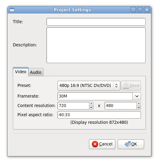
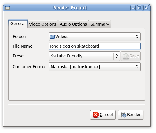
- Brandon is also working on cleaning up the Project Settings dialog and the Render dialog. Here’s a peek at how they look like at the moment (“render_dialog_cleanup” branch):

Note: I suggested that the Title and Description fields go into a dedicated “Metadata” tab, we’ll see.

However, PiTiVi 0.13.4 will be the version bundled with Ubuntu 10.04. It is quite basic, but, like many new applications in Ubuntu, should benefit from the large testing user base, and hopefully gain some new contributors. The current work highlighted above gives me an optimistic outlook on PiTiVi’s future.
Want to help out with PiTiVi? We need all the help we can get! Take a look at our contributing page.
Sintel logo proposal
I shall conclude this blog post by highlighting how awesome Inkscape is. In a matter of days, I managed to create this logo entry for the Sintel open movie project entirely in vector art.
While it took me a long time, I mastered the (over)use of shape masks and learned how to use “Live Path Effects” along the way. Some folks on #inkscape have been very helpful in pointing me in the right direction (which part of the documentation to look at). Along the way, I encountered a nice rendering bug with Live Paths Effects. Basically, my nice dragon scales looked like this:

Looks like Inkscape shares some attributes with inkjet printers! 😉 To work around this problem, I had to fiddle with the DPI/rendering resolution until I stumbled upon something that renders correctly. Ew.
Also, it seems Inkscape gets real sluggish on a Core2 Quad when you have a LPE with 9785 nodes on top of a dozen layers with masks and blur effects. And yet, somehow, I was surprised. Can you believe how demanding I have become of computers? 🙂
All in all, hats off to the Inkscape project. A great app, easy to pick up, stable, and a joy to use. You provided me with lots of fun in the past few days.
Comments
10 responses to “Hello, PiTiVi happenings, Sintel”
Will it be basic titling or more fancy kind of titling?
I ran into the patter issue as well. It’s filed as https://bugs.launchpad.net/inkscape/+bug/381022
@Brian what is your distinction between basic and advanced? I guess if you consider font face, size, color, bg color, position to be basic attributes, then it would be basic. But I’m not sure what else there needs to be (except animation for credit rolls or something)
What I consider fancy is 3d titles, but I don’t need them, and that seems like great news. and this is a bit off topic but what is it called when you put a logo or animation in the corner of the screen( sometimes transparent) I want to make a feature request but not sure what to call it?
Nah, it won’t be 3D titles (maybe it could happen in the future if someone wants to have a go at implementing it).
Putting a logo/text in a corner would be called “watermarking”, I guess. But you can already do that as far as I know, simply use a PNG image with an alpha channel (transparency)?
What do you mean alpha channel. Is this in the git or 0.13.4. because this is a pretty useful feature for me. and When does the student from GSOC start (sorry about the constant topic changing?
Alpha channel is just the technical term for “transparency”. Basically if you have a PNG with transparency it should work with 0.13.4.
For Thibault’s schedule, take a look at http://socghop.appspot.com/gsoc/student_proposal/show/google/gsoc2010/thibaultsaunier/t127060149183 which contains a roadmap/schedule.
That is great, that he will be able to do that. PITIVI looks like it starting to pick up steam! I hope to start developing this summer, Hopefully there will be enough stuff to work on 😀
HI,
This is not directly related to this post of PiTiVi (which i am not using since i don’t do video edition, at least for now), but one of the screenshots prompted me to do a quick mock-up in The Gimp.
One thing that bugs me in Gnome’s UI is the wildly varying heights of UI controls. I was wondering how it would look it most controls had the same height. Here’s the result of my (graphic only) test:
http://dl.dropbox.com/u/145744/screens/gnome-ui-height.png
Maybe one day i’ll dive into Gnome theming, GTK-related bug reporting, etc. 🙂
I would love to see animation for credit rolls implemented into the titling. Looking forward to seeing PiTiVi go really far. Can’t wait!