Let me tell you about a small usability improvement in Pitivi that might provide some inspiration to others.
See, I hate scrolling. Unless it’s absolutely necessary and the dialog is bigger than my screen’s height or you expect to tile windows vertically, as an application developer you should avoid scrolling when possible.
2024 edit: a few months after my article came out, someone else came up with a funny term that describes unnecessary UI tasks that the computer should take care of automatically: “shit work.”
How do you avoid scrolling with dynamically-generated widgets?
- The “correct” way is to size the dialog automatically depending on the contents and to use a the available screen space (instead of showing a tiny window).
- Sure, you could just remember the size of the window instead, but this doesn’t work too well for dialogs that have transient dynamic contents (ex: Evolution’s mail send/receive progress dialog), and, from my experience, computer illiterate users will not even think of resizing windows.
- What I found out through experimentation is that setting the “default size” of a window to be greater than the available space on the screen works 100% fine with most (if not all?) window managers. What this means is that if you expect the user to scroll a long document, you might as well set its default height to 1200 pixels or something: if the screen is only 600 pixels tall, the window manager will size it down.
- In Python with GTK+, that’s the set_default_size method, right before you actually show the window (not to be confused with the set_size_request or resize methods).
See also MPT’s lightning talk on common interface bloopers (in which Pitivi was cited as the prime example of “bad default size” back then).
Most of pitivi’s dialogs are home-made with a reasonable set of expectations regarding size: we know in advance the size of the main rendering dialog’s window, for instance. Ok. That’s easy. No problem here.
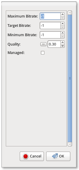
The problem is that some of pitivi’s dialogs use dynamic/autogenerated content. The advanced codecs settings dialog is one of them. Since the amount of stuff that is shown in that dialog is highly variable depending on what codec the user wants to configure and yet you can’t be sure that it will all fit on the screen, you end up with failsauce like this:

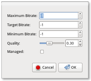
Yes. This is how it looked like for the Vorbis codec! Until now, that is:

As you can see in this commit, I implemented a naïve approach to detect the “height” of the vbox containing the actual contents (once they have been generated), and then, if the size makes sense (or if we have a lot of available screen height), size up the dialog so that this fits neatly. If there is a much better way to do this, patches are welcome!
Since it fits neatly in most cases, then we can get rid of the scrollbar and border around the contents. We end up with a dialog that feels less like an afterthought.
Do you have dialogs in your application that have a bad default size? Sometimes, remembering their size is not the answer. Save your users some strain and put that 1920×1200 monitor to good use!
Comments
4 responses to “Don't make me scroll”
The scrollbars don’t really annoy me…I’d rather they weren’t necessary, and they look out of place, but they don’t annoy me that much. What does annoy me is when a dialog or window tries to remember it’s previous size when its contents aren’t the same and won’t fit any more, whether there’s a scrollbar or not. I can’t say whether that annoys me more or less than when a window is too small for it’s contents and not resizeable…both situations are terrible.
Thanks for pitivi – it’s a great tool becoming better!
I would suggest handling the main codecs (ogg, what else?) in a non-auto-generated form.
Although being a programmer (a technical user) i’m not familiar with the codec world, but i do occasionally want to put something together.
When trying to tweak the output, i’m stuck with the “magic numbers” – knobs and levers with obscure labels. I then either (a) go to google and spend 30 minutes trying to figure out things i could care less about, or (b) poke them while i get something working, and that can take same amount of time too.
The “-1” i guess means “do not limit” for the bitrate. But wouldn’t “0” mean the same then? Also – all three min-target-max controls that are very connected are totally disconnected in the UI and you could have target out of the bounds of min and max, and min higher than max.
If this sounds like a custom widget you can try using hamster graphics (https://github.com/tbaugis/hamster_experiments/wiki/) to craft one in a sane manner.
For the quality – perhaps instead of slider a drop-down with bunch of preset qualities would be much better – uncompressed, high, medium, low, extreme – something in the lines.
And managed – now this one need either rephrasing and a description.
Agree with #2. Also, I don’t see why this dialog isn’t instant-apply. Instead of Cancel and OK, ‘Close’ should be sufficient.
Hey folks, sorry for taking so long to reply.
@tm: about 0 and -1 and whatnot: that depends on the gstreamer codecs… I guess it would help to have someone do a quick UI review of the settings for all the gstreamer codecs available to pitivi and file a bug on gstreamer so they can standardize values.
Custom UIs: codec settings exposed through gstreamer seem to change very often, and I’m not convinced I’d be able to come up with a much better UI for it given that codec settings are inherently complex, but I guess it’s again an issue with gstreamer: some codecs provide simple options. For example, compared to vorbis, the speex codec shows a combobx for the quality, with discrete values with a text annotation.
But then, at the same time, one of the gsoc projects this year is to allow profiles for rendering and making it easy to upload straight to youtube/dailymotion/etc, so the impact of “advanced codec settings being complex” may be lessened.
Finally, there are so many more pressing issues to deal with, I’d love to see a patch to do the cleanup/custom UIs you suggest, but without it I doubt it would happen really soon.
@ReinoutS: I guess it should be a set of “Reset” and “Close” buttons instead. Filed bug 655188 about this.