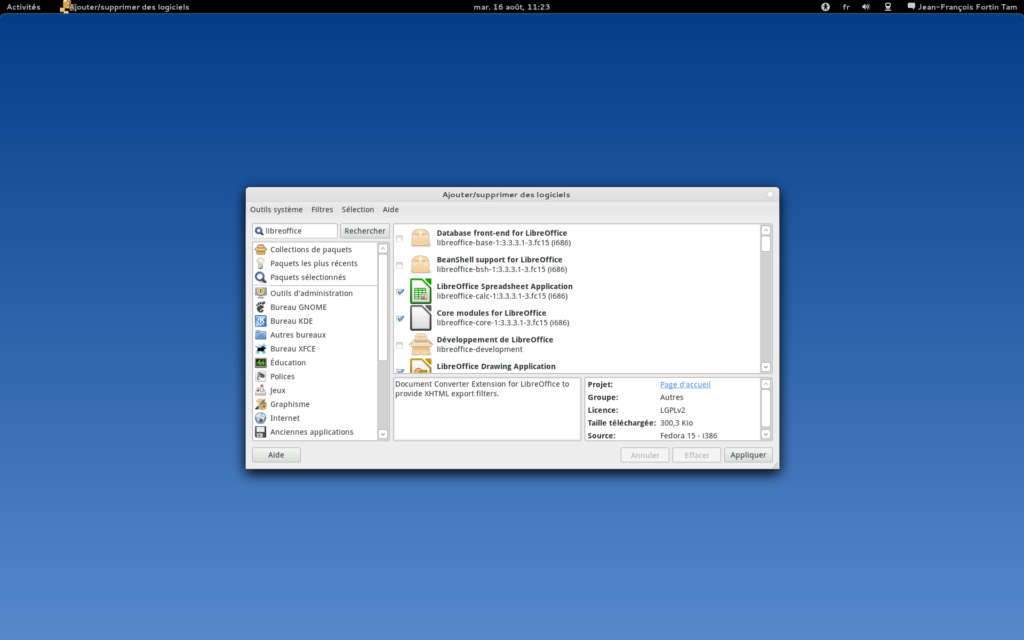
In the same vein as my don’t make me scroll post, I sent a couple of patches Richardwards to, among other things, solve one of the biggest itches I had with gpk: the fact that I had to care about sizing it up constantly on my 1920×1200 24″ monitor. Before, if you started gpk-application (or the update manager, or various other windows), it showed up like this:

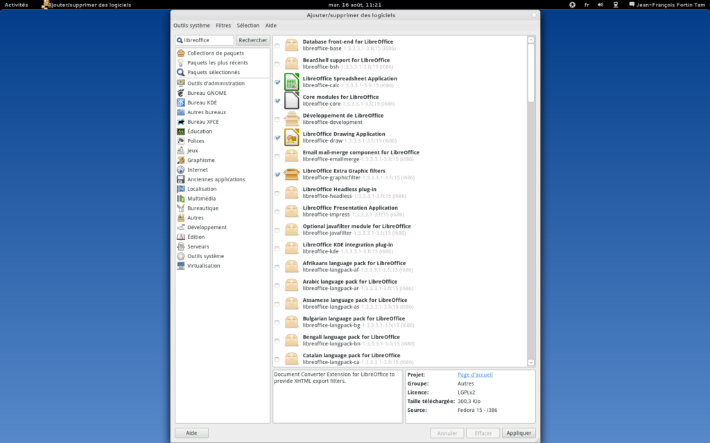
Now, it shows up like this, finally making use of your screen’s vertical space:

Also, Richard has made my day when I suggested that the version numbers be a little bit less prominent in package lists (to reduce visual noise) and he Just Friggin Did It™. Thanks!
Latest posts by Jeff (see all)
Comments
9 responses to “Improving GNOME PackageKit on big screens”
Hey, here’s a recommendation: improve pkgkit on *any* screen first 😉
Yeah well that’s a bit beyond my skills or available free time at this point 😉
Smart decision, no app should present a user with that many scrollbars.
Great little improvement!
However, I think it might be a little better if there were just a little bit of “breathing room” above and below the app window. (In other words, not fully vertically maximized, but almost.)
@Garrett: well the way the “trick” works is to request 1200 pixels vertically, and to let the window manager cope with it and allocate space as it is available (I tested this on metacity, mutter, compiz without problems)… so it’s not really that smart 🙂
How about actually saving the last window size instead? This works great with other apps, especially when paired with gnome sessions.
@Danilo: this is what I thought I wanted at first, but then I realized that the package manager almost always displays huge long lists of packages, and that simply sizing it up to a better size by default would solve the problem in a way that is simpler and would probably please more users.
I don’t see this as an improvement really. It’s a nice thing to make it a bit taller on screens that can fit the window, but 1200 pixels is a bit much, especially considering you have important buttons both in the top and the bottom of the program.
Don’t forget to test that light gray text on low contrast monitors (for instance, an older laptop in sunlight). Graphics designers tend to forget there are people out there with less than optimal monitors.