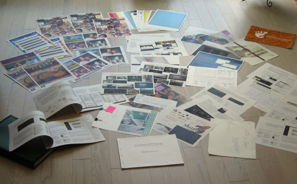
Cleaning up my apartment today, hoping to get rid of a pile of draft papers that has been cluttering my space for six months, I’m taking the opportunity to write about what this particular pile of paper means (yes, my blogging backlog goes that far—I am draining the swamp one post at a time!)

For the longest of times, as a designer flying under the radar (my management and marketing work is more “visible”, ironically), I did not have a proper portfolio. In fact, I had made a portfolio only once in my life, assembled in a few days in 2011. While my work as idéemarque in the past few years has led me to do a fair amount of design work, I was so busy with business work in general that I never took the time to do the massive amount of research and planning required to make a new one.
In early 2016, I finally sat down and made a new portfolio. Those who have worked with me know I’m a perfectionist, and since I had finally set my mind on doing this, I would be doing it right. It indeed took me 2-3 months of research, writing, designing, revising, redesigning, print testing, revising again and fixing issues, until I ran out of issues to fix.
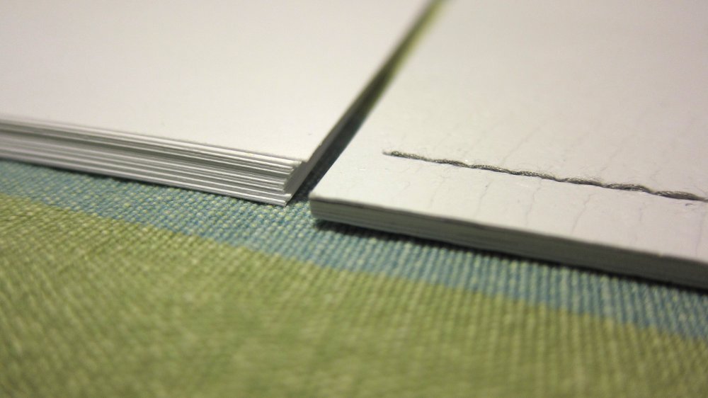
From the start, I decided that it would be a top-quality print-only edition. I used beautiful, legible and readable fonts to make reading on paper a delightful experience. I invested in premium quality paper (including some semi-transparent sheets) and used a high-end printer, but not a commercial printing press as that would have been ridiculously expensive and inflexible for printing only a handful of custom-made copies. A print shop couldn’t have provided all the fancy features I required anyway (fancy binding, specialty paper, embossing, etc.). Therefore each of my portfolios is a hand-made craft—even if it might not seem that way as I made it full bleed (edge to edge). This whole project made me learn way too much about troubleshooting printer color problems, printing on unconventional paper types, faking bleeds, and the traditional bookbinding techniques of my ancestors.

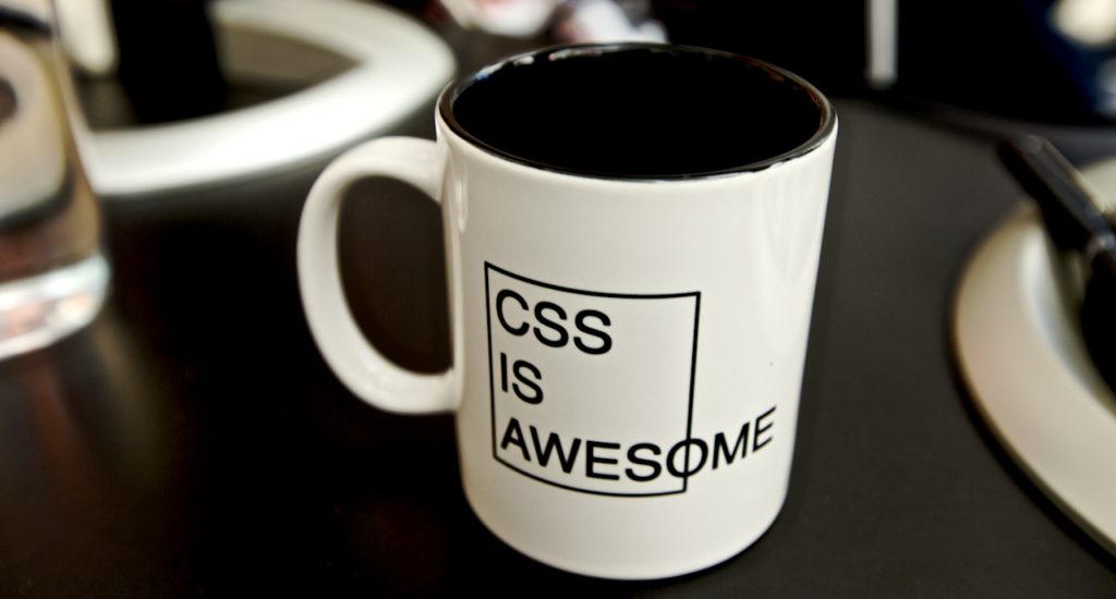
In 2016, a printed portfolio might seem outdated compared to an online portfolio. Yet, mine is designed for print, precisely because the web and cheap emails have become the norm in this era of constant noise, and because I prefer to control everything in the reader’s experience—including the delivery, the typography, the texture, size, depth, resolution, and the physical (and mental) weight of the document. And not having to “/%$?%*)&!?” around with CSS and “modern” web development is a huge plus.

Some said, “How can this be such an involved process, taking you months?” to which I replied that, among other things, the document was roughly thirty pages. This got me some expressions of bewilderment, until I explained, “It’s not a graphic design portfolio, it’s a human-computer interaction design research portfolio.”
While it took a long time, the project was worth it, both as a personal challenge and from the reactions I got afterwards.
I have now decided to remove any traces of my portfolio from my website (except the photo and illustrations gallery). A website is not only a pain in the ass to maintain regularly, it’s typically ignored or skimmed anyway (basically, Schrödinger’s Visitor). For those who requested an electronic version of my portfolio over the past few months, I have insisted on shipping them the print version instead—tailored for them, of course.
Taking down my online portfolio3 min read
Latest posts by Jeff (see all)