I meant to finish writing and posting this a month or two ago, but urgent tasks and life kept getting in the way. I don’t often talk about client work here, but since this is public-facing ongoing work for a company that is insanely pro-Free-Software (not just “open source”), a company that ships GNOME3 by default on their laptops (something I have awaited for years), I guess it makes sense to talk about what I’ve been up to recently.
So, for a few weeks three months now, I have been helping Purism structure its messaging and get its business in a better shape. Purism is, in itself, a hugely interesting endeavour. Heck, I could go out on a limb and say this venture, alongside the work Endless is doing, is quite possibly one of the most exciting things that has happened to the Free desktop for the past decade—and yet almost nobody heard of it.
Before I can even consider visual branding work (maybe someday—when I get to that point, that would mean things are going really well), there was a fundamental need to fill various gaps in the strategy and daily operations, and to address messaging in a way that simultaneously resonates with:
- hardcore Free Software enthusiasts;
- “Linux” (GNU/Linux) users and developers just looking for great ultraportable workhorses;
- the privacy/security-conscious crowd;
- the public at large (hopefully).
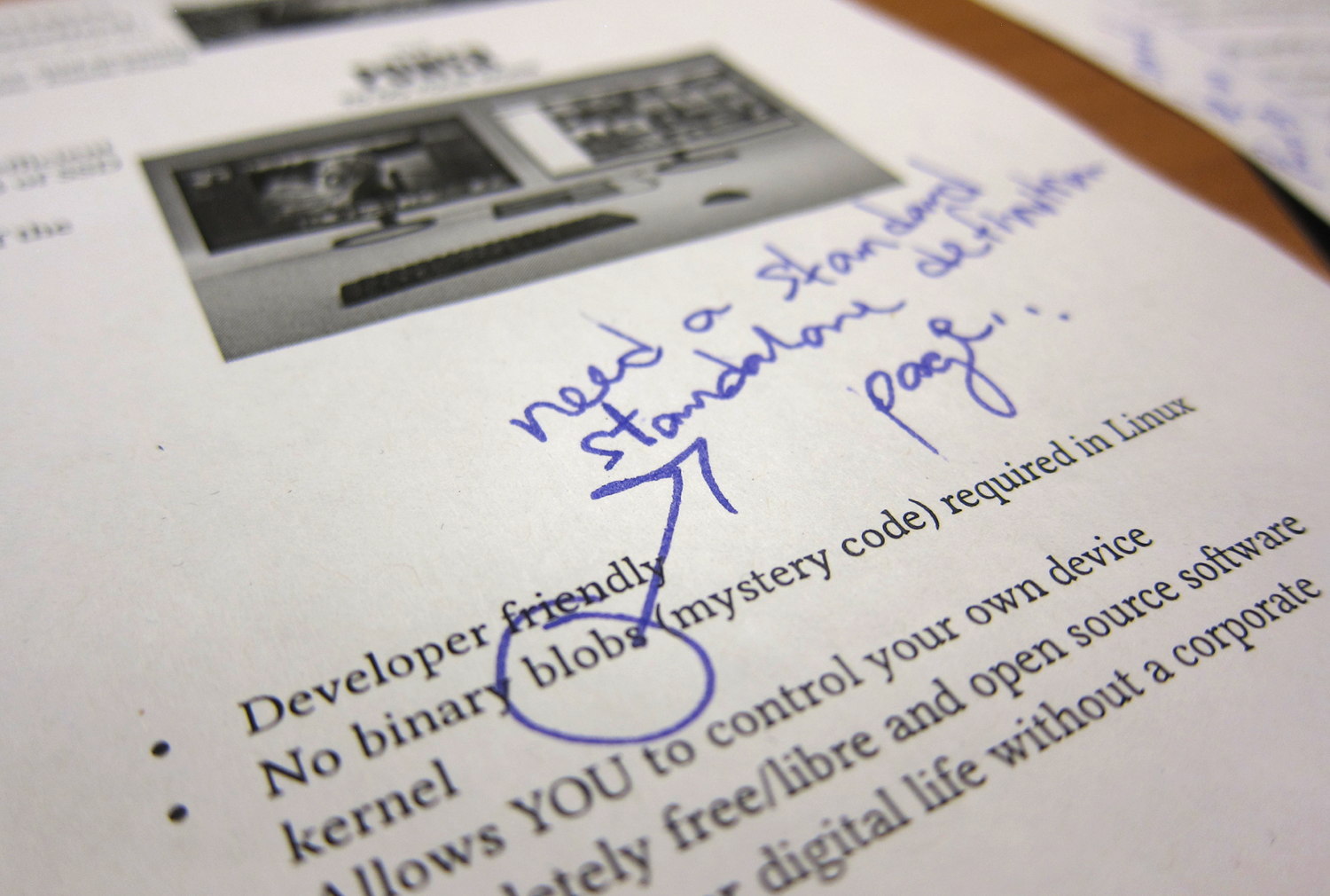
Purism’s website and previous campaigns were full of relevant content, but it was disjointed, sometimes outdated, and sometimes a bit imprecise, confusing, or just plain boring. You really had to be abnormally motivated to dig deep and digest a ton of fairly arid content. I set out to fix all that, so I looked at every single page on the website and external campaigns to rearchitect everything back into a solid foundation, something insightful and pleasant to read.
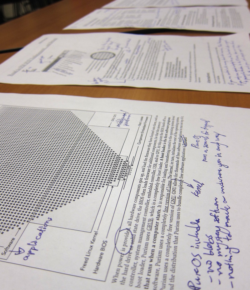
There was so much buried and scattered information to analyze, I coudn’t have done this with computer screens, no matter how large. I decided to print out a summary for easy annotation. Even with super compacted text (small fonts, tight paragraphs, fewer images, etc.) and redundant text passages removed, my “content review summary” document of the core content was still a whopping 28 pages in “US legal” size (8.5×14 inches). It easily occupies all my office’s desk space:
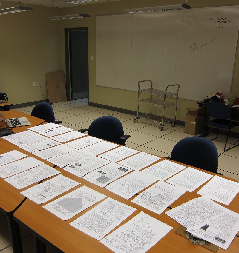

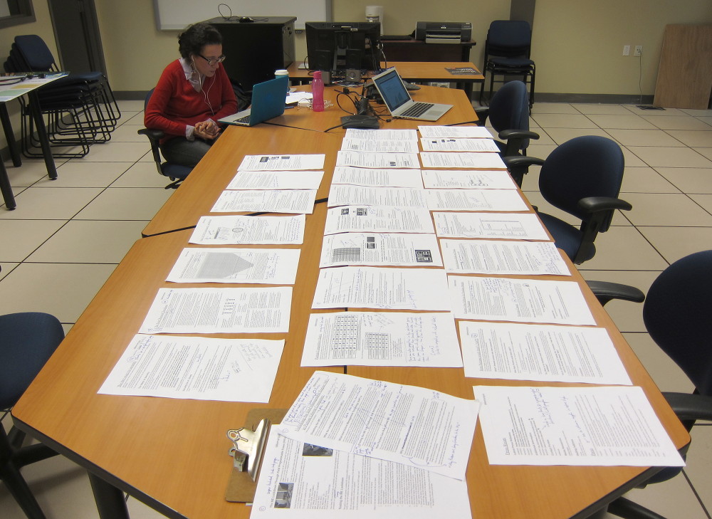
Serious business.
Having no time to waste, and having made a very clear list of issues to fix, I applied my proposed changes directly after completing the semantic and structural analysis.

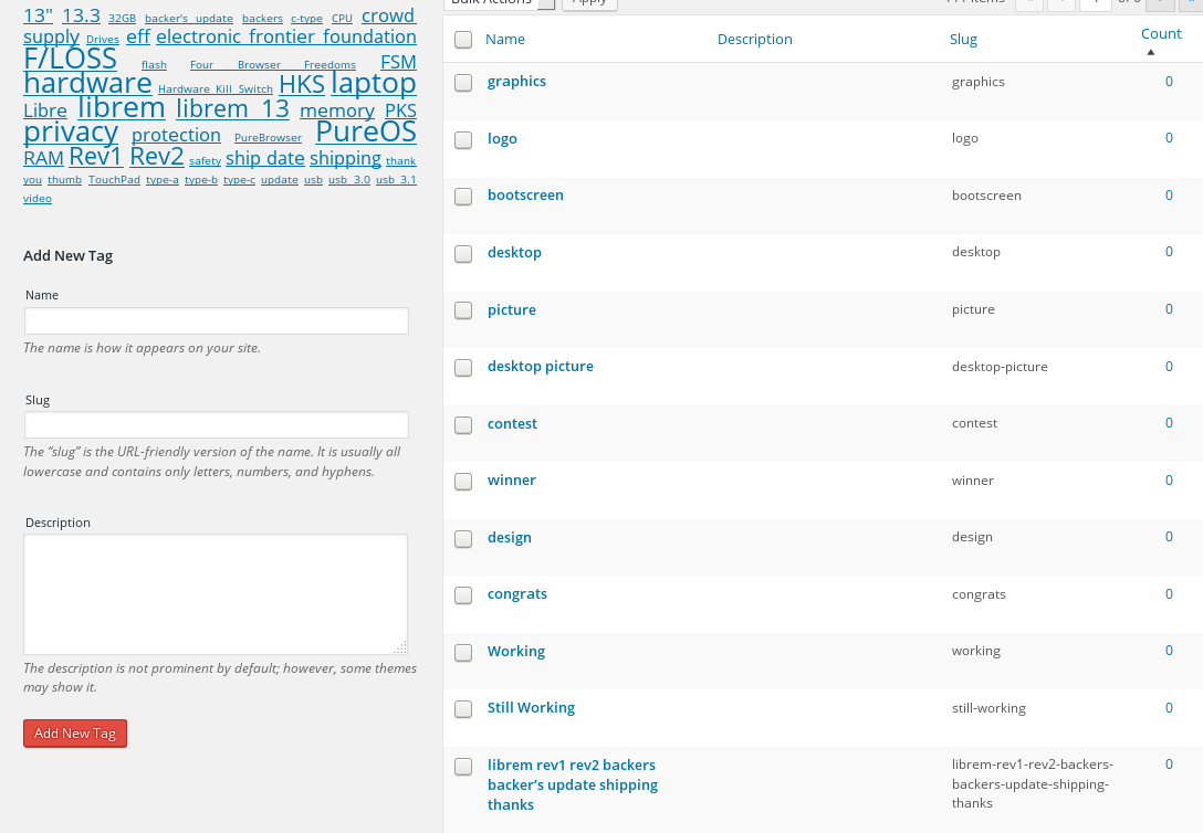
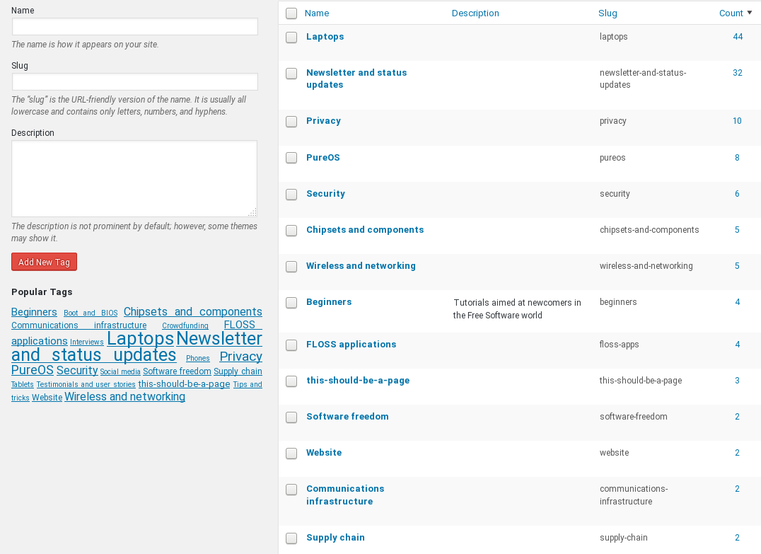
The taxonomy and ontology in the blog section was all wrong, too. So I rethought and reorganized all the tags and categories, to create a reliable system for visitors to browse through. For example, I made the tags go from what a noisy mess (pictured on the left) to something much more meaningful (on the right):
The website overhaul led to the new “Why Purism?” section, the new Global Shipping Status page, a much nicer stylesheet (my eyes were bleeding trying to read anything on the website and its blog), URLs that actually make sense, and a rethought product discovery and purchase navigation flow. Some more details on the overall changes can be found here. Hopefully, the current state of the website is much more enticing now. It may not be perfect (feedback welcome) but it’s a good start.
I also paid attention to a bunch of papercuts when it comes to interacting with the community. For example, blog posts lacked a relatable face, so I added avatars for everybody. Forums had an absolutely horrible mail notification system, so I fixed that. People were unsure about warranties, delivery dates, etc., so I made sure to help clarify those as best as possible throughout the website. That sort of thing.
The next big steps, in my view:
- Helping ensure the business’ viability, beyond just “survival”. Running a “normal” hardware manufacturing business is already fairly complicated from the get go—so making an independent “organically grown” one profitable, that is much harder. Purism is at a turning point right now, and the coming months will be a real test of the feasibility of reconciling Free Software with modern hardware. Most of us have been waiting so long for this, failure is not an option.
- Improving the customer experience.
- Improving the product design.
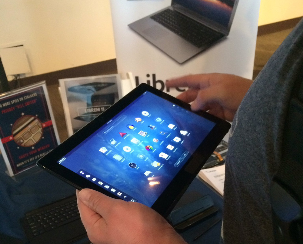
By the way, I have been testing out a “Librem 15” laptop extensively for about two months, and I am hoping to publish a very detailed review and feedback video soon (I don’t do superficial/half-assed reviews, hence the delay). Stay tuned!

You can check out my main website, find me on Twitter or Mastodon or subscribe to my YouTube channel.
Comments
3 responses to “Helping Purism structure its messaging”
Hi Jean-François,
as always, you’ve been doing a wonderful work. I’m seriously considering buying a Purism computer and see how it works. From the specs, I’m tempted to buy the medium one.
Keep up the good work!
Well if that’s the case you wouldn’t be the only one to pick the “middle” one, because as far as I can see the 13″ laptop is indeed the most popular of all the models, much more than the other two. I’m hoping Purism sends me one to review someday when a new batch comes out.
Anyhow, thanks for the cheers 🙂
I would love to read such a review!