A little over a year ago, I wrote about my humble restoration of an old drawing of Cubitus and Sénéchal, which was a straightforward operation. Shortly after, I began working on another piece of artwork to decorate one of my walls, this time my own bespoke painting, made 100% with free software.
I did not want to buy some generic framed/canvas picture in a retail store, nor did I want to simply showcase some other artist’s illustration work (even though there is no shortage of jawdropping illustrators on DeviantArt): that would have been too easy, where’s the satisfaction in that? Having far too few occasions to do illustration work in my life, I wanted to challenge myself to create something meaningful (the depicted scene needed to tell a story) and that I can be artistically proud of.
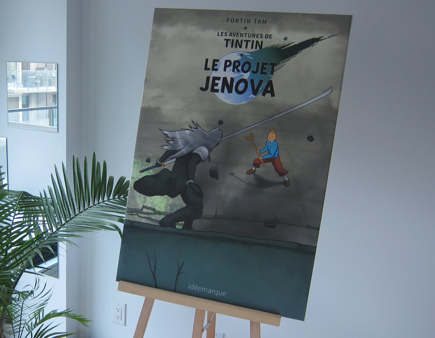
I also wanted something quite big, so I planned to work in “Arch D” format (24×36 inches) and to have it on canvas material. I wanted to push myself to a level of detail and perfectionism way beyond my previous illustration works; no shortcuts and no time limit! Beyond the fact that 24×36 allows cramming a lot of detail, I thought, “If I am to hang it on a wall and look at it more than once, it needs to be perfect”.
The concept
As a fan of Final Fantasy VII since its inception around 1997, I found the Advent Children movie fairly amusing. The ridiculously over-the-top physics-defying action scenes paired with inside jokes and japanese-style screenwriting, certainly make this movie palatable only to those who played the game and are used to the quirks of japanese animation & movie subculture (for non-fans, I can imagine it being a big messy incomprehensible embarrassment).
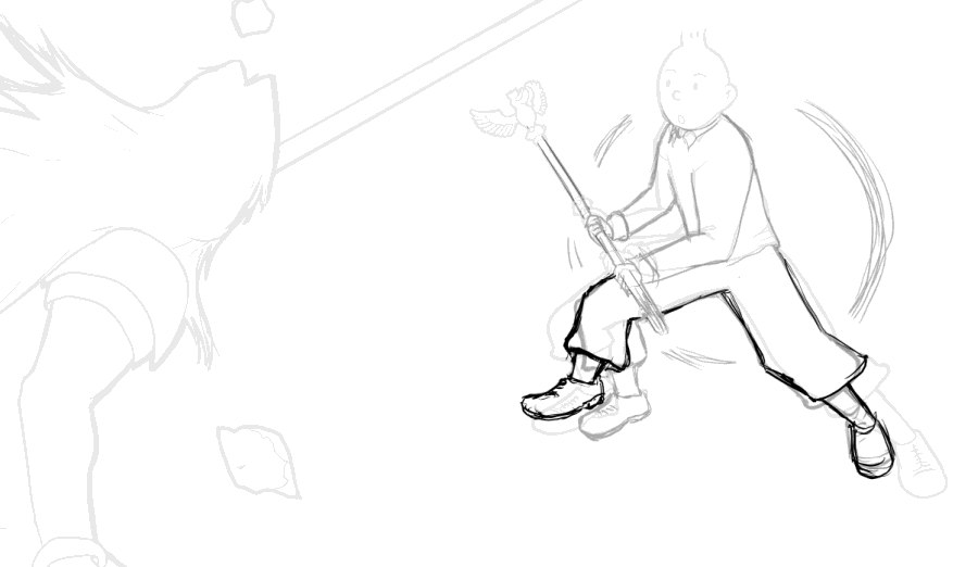
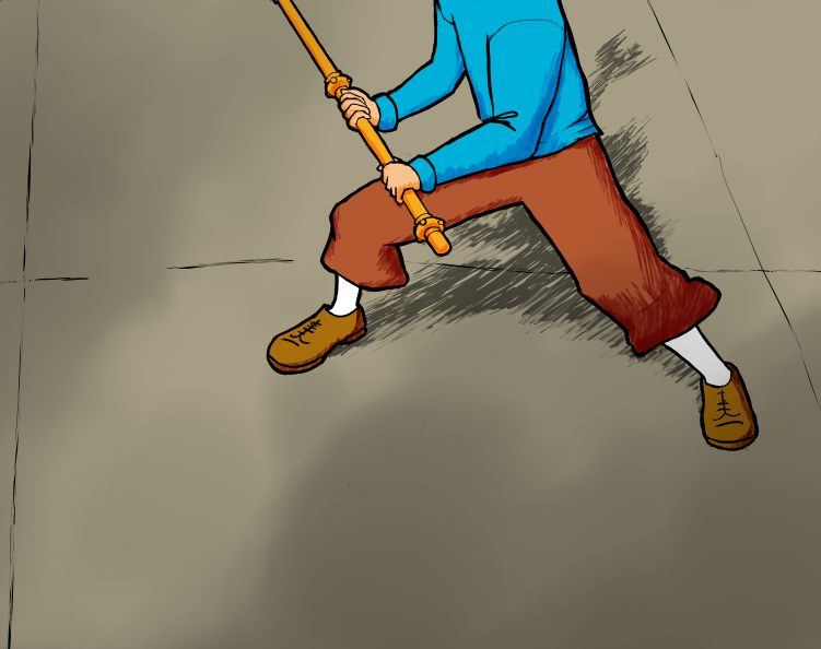
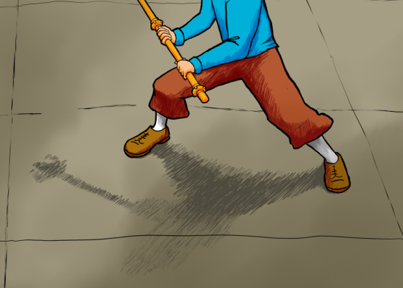
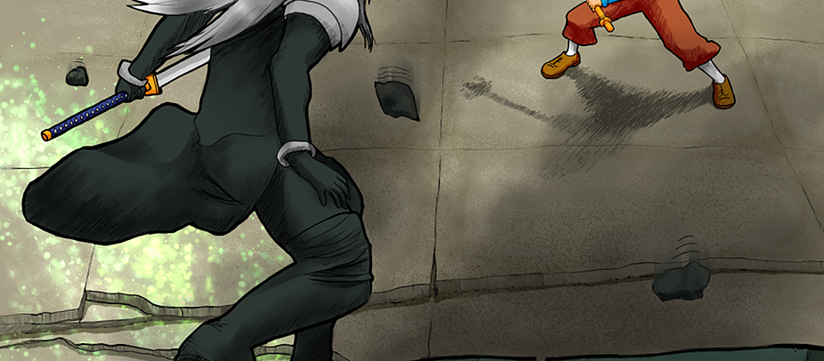
In particular, there is the climatic 10-minutes-long fight between Cloud and the most infamous videogame supervillain of all time, which contains a short-lived action shot around the 4 minutes 30 seconds mark where Cloud and Sephiroth land on a gigantic tiled floor laid atop massive concrete, a platform that then suddenly fractures and folds its halves to a perpendicular angle, depicting the two combattants in a pretty epic visual composition.
Another reason why I remember this scene in particular: it is the only moment in the entire movie where you can see Sephiroth almost losing his footing, which adds to the unusual nature of this short segment. Here’s a frozen frame (not to be confused with the frozen flame, different RPG universe):
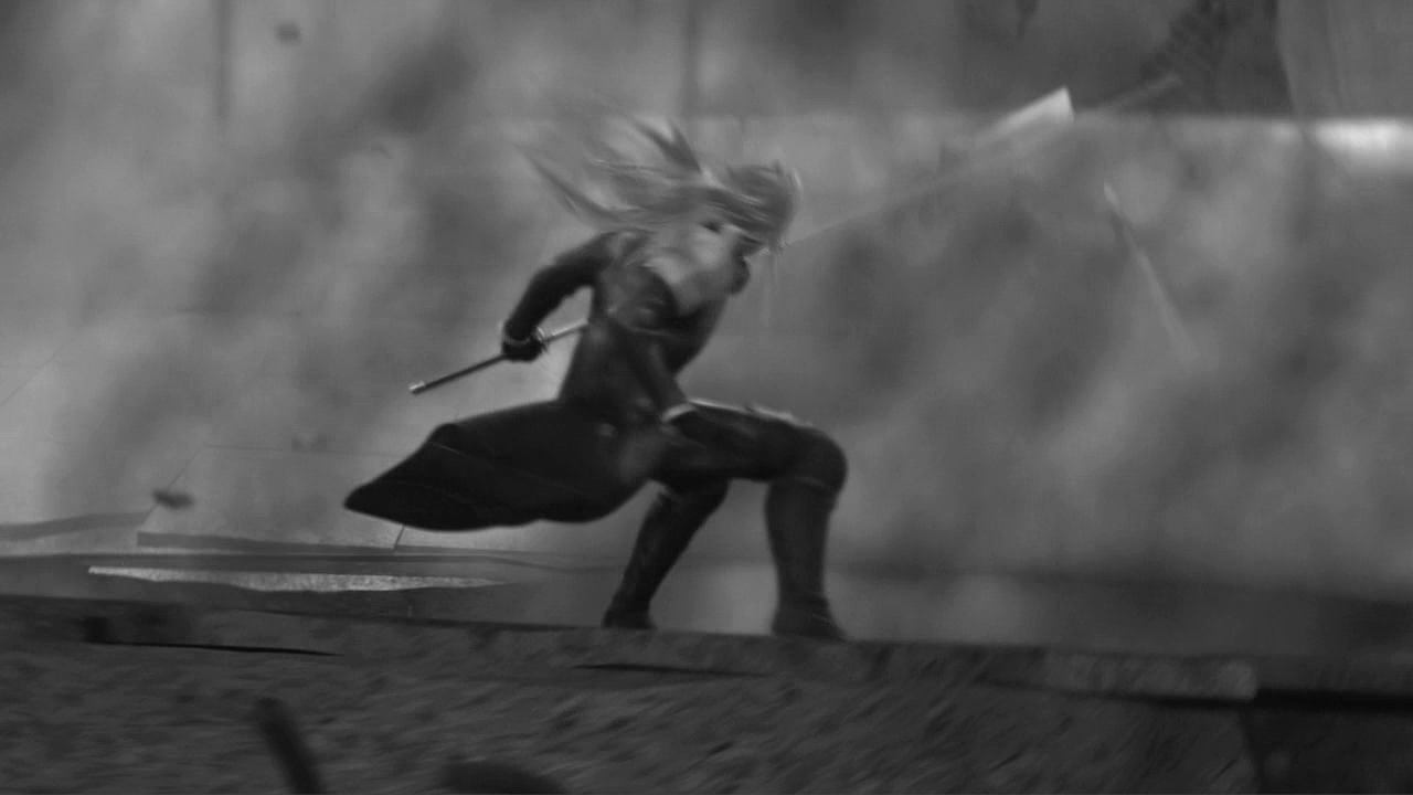
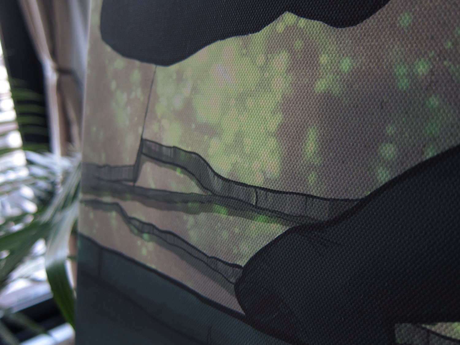
There is so much chaos (motion blur, dust, débris falling) that it’s really hard to see what is going on there unless you watched it in motion. Here we can see Sephiroth looking into the dust cloud emanating from the fracture, and we can barely make out the shine from Cloud’s two swords behind the dust. So I decided to reproduce this frame, albeit with more clarity—after all, who would care about some “dust Cloud”, besides the Fremen of Arrakis?
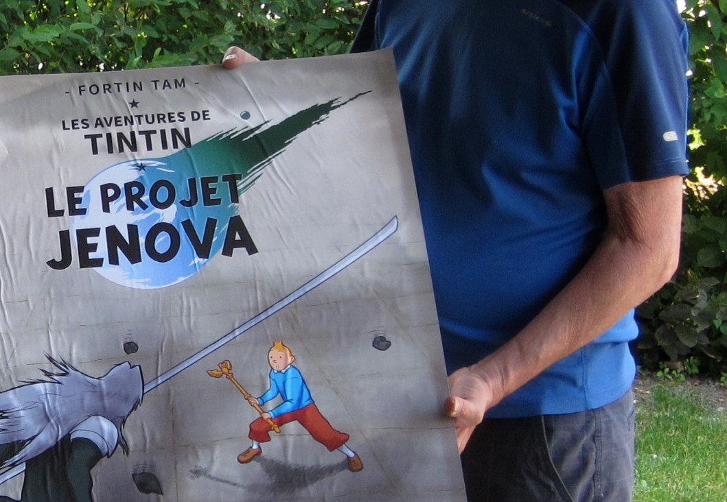
For my illustration however, I decided that Sephiroth would not be facing Cloud this time, but another blonde guy with rebel hair: Tintin. Why? Because Tintin is a badass, and Cloud is just “a puppet” who let the bad guy kill my waifu back in 1997, and all I got afterwards was this white materia (ˇò_ó)
Moodboard & sketching
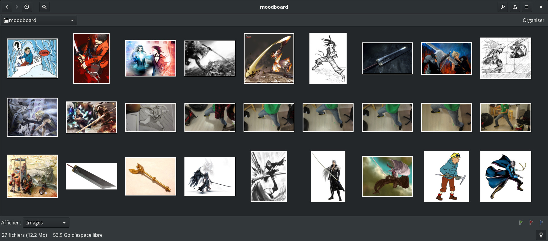
As part of my research and planning, I assembled a moodboard. Some character design reference art, some combat stances, object reference designs, and even some poses I shot with a camera to simulate what I wanted and compare with real world anatomy:
After all, the most time consuming part would be to make a sketch (and lineart) that would be “flawless”—I wouldn’t want to look back at the finished artwork and find flaws that would make it “un-watchable” for me.
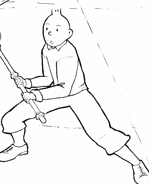
At first, I thought I would simply give Cloud’s “buster sword” to Tintin, but a quick “proof of concept” sketch revealed that idea to be suboptimal. The two swords would seem to be parallel, depth and scale would be tricky, and Tintin would be too much on the defensive. And it just wouldn’t be classy enough:
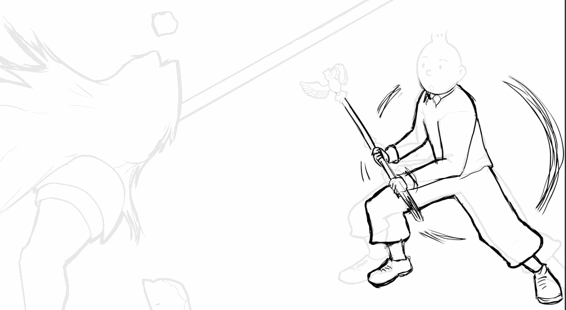
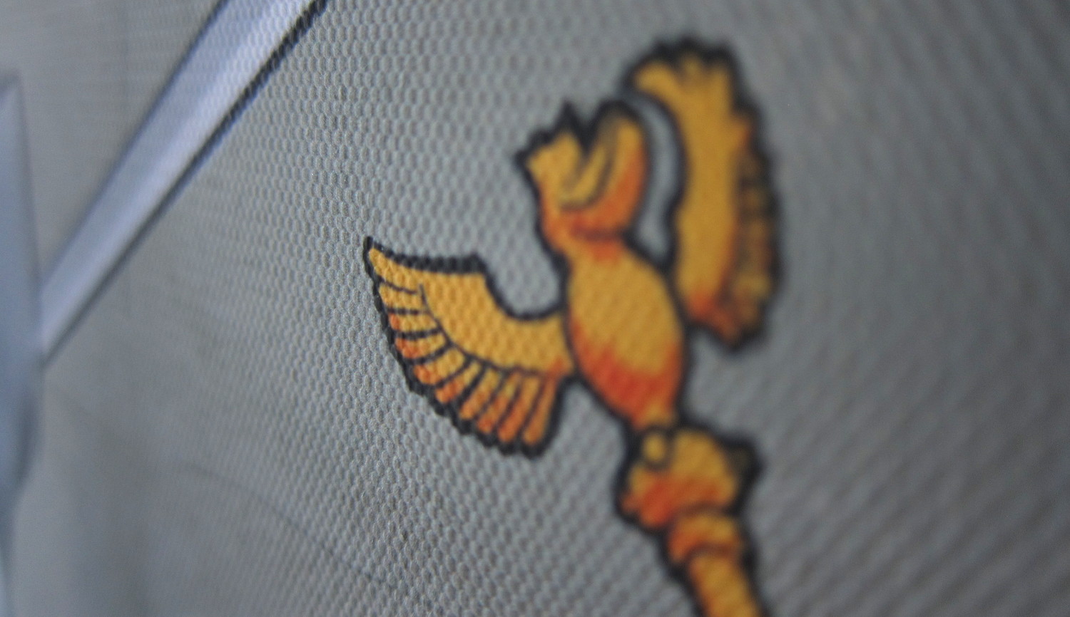
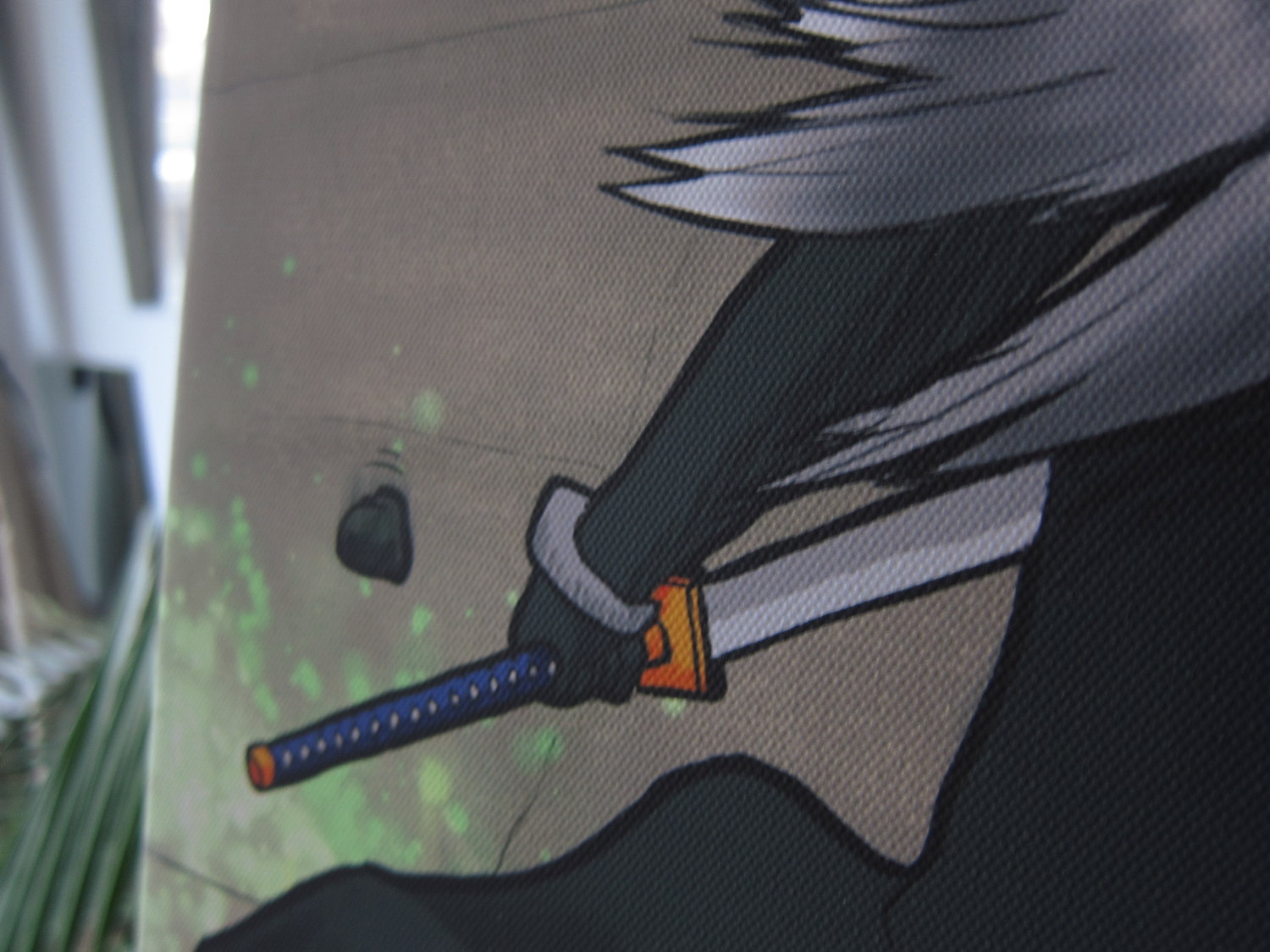
And then it struck me: I would instead expose Tintin’s badassity by arming him with nothing more than Ottokar’s sceptre to fend off Sephiroth’s infamous eight-feet-long Masamune.
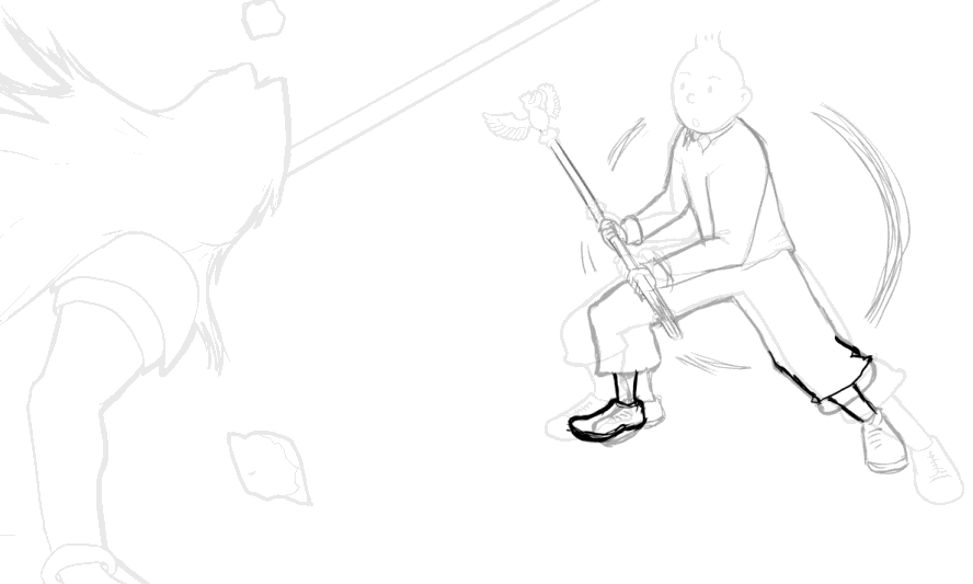
I started sketching near the end of November 2015, focusing on getting the poses and anatomy “right”, finishing around mid-January 2016. The process involved many revisions (including some drastic changes in poses) before I felt confident that the whole thing was “correct”. The original pose was this one, which seemed strange to everybody I asked:
Thus many other variants were attempted:
Many thanks to those who provided constructive feedback and forced me to correct anatomic mistakes or confusing aspects of the lineart. I must have been a real pest for the following people in particular: Mélodie Gauthier, Aude Motillon, Élaine Cloutier, Andreas Nilsson, Jens Reuterberg, Sedeto.
Colouring, shading, and insane hardware requirements
I was originally hoping to do something in the style of Alfons Mucha (whose “decorative art” works impressed me when I visited Prague in 2013), with strong outlines combined with subdued colours and semi-flat shading. However, a pure Mucha style would have been problematic in this particular situation (lots of dust needing to be overlaid on top of characters without obscuring them, grain and imperfections required to give life to the very industrial landscape, and shadows required to provide depth and perspective). I had to take a hybrid approach, trying to blend Mucha, Hergé and Nekohayo’s approaches.
I’m not as masterful as famous painters of centuries past, and my spare time is very limited, so I need a computer with productivity-enhancing software to do something good in a reasonable amount of time (with the ability to undo/redo, erase anything cleanly, and the ability to have dozens of layers to experiment and composite things). We live in an unprecedented era in human history when it comes to access to powerful creativity tools—software freely available today makes it feels so damned easy.
I have, by the way, been humbled seeing the amazing work Mark Ferrari does with 8-bit colour palettes and fake animation through palette colour cycling—a true master of light and colour theory, whose existence was revealed to me by Jakub’s post—but I’m definitely not patient enough to be doing pixel art on such a big scale.
So, for this occasion, I used:
- The development version of MyPaint, self-compiled from Git (because version 1.3 was not yet released back then, and, well, #YOLO) for the whole painting. GIMP was briefly used for the concept research sketching phase, and Scribus for the final print layout/titling. My operating system is Fedora. So, for those who thought Photoshop + Windows/Mac OS is the only game in town, let this be yet another testimonial to the quality of libre graphics software we have at our disposal, as this was made exclusively with the Free/Libre and Open-Source software listed above.
- A 24″ Wacom Cintiq borrowed from the office.
- A workstation-class machine with a Xeon W3520 and 24 GB of RAM, that I purchased and repurposed specifically for this project (behold the epic tale of its restoration).
“Wait, 24 GB of RAM and a Xeon, just for painting?” Yup. 24×36 inches at over 300 DPI (“Because! What if I want it bigger?”) meant my image was 113 megapixels (9000×12600) multiplied by about 50 layers, which means humongous memory and CPU requirements.
Sure, if you look at the painting’s filesize you may think, “a 350 MB file? Doesn’t look so big to me”…
…but if you consider RAM usage, we’re playing a different game:
Even saving and loading the file was a bit painful (I reported bugs regarding MyPaint lacking a progressbar when loading and under-utilizing the CPU and doing extraneous work when saving project files).
In any case, I also wanted that overpowered workstation to enjoy my daily research work “without having to worry about RAM”. I’ll soon blog about my long quest to stabilize it for general use, other than just “painting”. That’s a whole other topic.
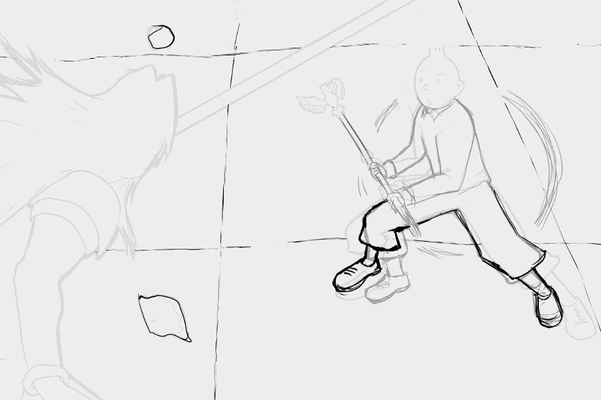
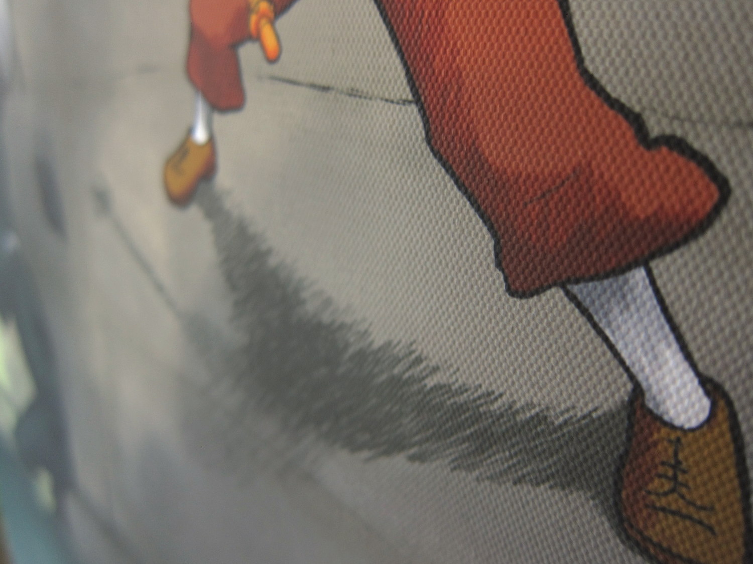
I did the colouring, shading/lighting and texturing over the course of a week or two in January 2016. The only tricky part was nailing Tintin’s ground and leg shadows, to provide the correct impression of depth and perspective while keeping the “light source” consistent with the rest of the scene’s shading. For example, this is what I initially had:
But it had a number of issues, one of which was perceived incorrect anatomy. So here’s what I did, to give the proper perception of foreleg angles and depth with the light coming from the top (the sky) instead of as a spot-light emanating from Sephiroth’s fiery gaze:
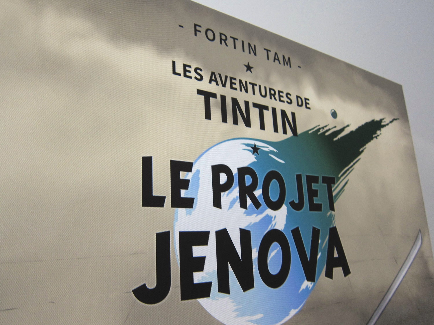
I then worked on the titling and final print adjustments during the spring (I had to extend the painting some more, as I realized I had miscalculated my canvas size and aspect ratio), until I came to a final version in May that year.
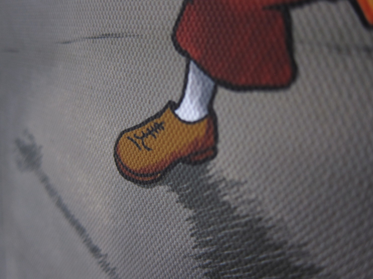
I had, so far, spent a total of roughly 47 hours working on this painting (21.5 hours sketching and 25 hours colouring/shading/compositing), and I was happy with the result:
I was now ready to bring it from digital to print.
Canvas transfer
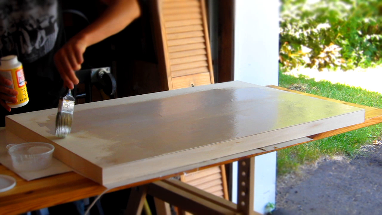
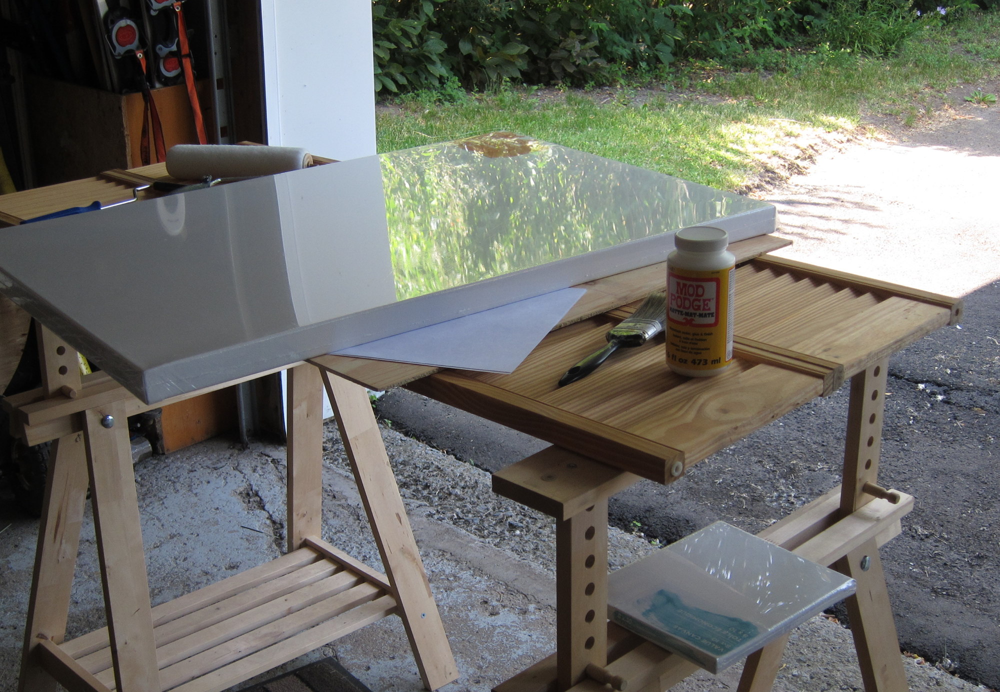
My goal was to have the artwork on canvas material to get the look & feel of a “traditional painting”. However, I considered that typical canvas printing services at 200$ were “too expensive” and that “I could do that myself for 50$ by transferring a printed poster onto canvas with Mod Podge.”
Big, big mistake.
When I found the time to attempt this, in June-July 2016, I bought 10-15$ worth of Mod Podge, a 13$ roller, a 23$ arch D canvas, and had the artwork printed as a regular poster for 12$. With all the equipment on hand, I thought, “Now I just need to do the transfer myself. This will be a cinch!”
I tested mod-podging a sheet of paper on a small surface:
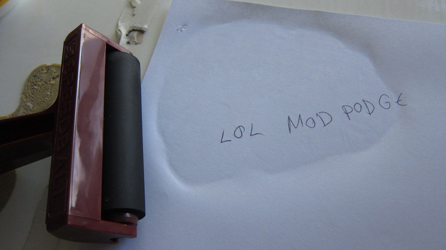
No problem! As seen on TV YouTube! So I went to do the same with the full-size poster and, well, this is what happened:
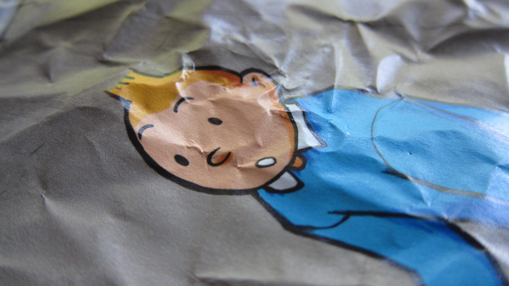
Even though I had applied the bare minimum of Mod Podge to the canvas surface, the print would get creased after the fact, forming big air pockets as the material would react to the Mod Podge’s humidity, making it impossible to have a straight surface. I even devised a special “acupuncture” technique to try to get rid of the pockets as they formed, no luck. I read every guide and watched every video under the sun, and couldn’t figure out how to solve this; there was no way to keep the air pockets from forming after the initial press-rolling, not with a poster of such dimensions. I guess my case was a special case. Either that, or all those sons-of-a-bitches on the Internet lied.
Luckily, I was able to at least salvage the canvases every time by scraping off the poster and Mod Podge in extremis and washing the canvases with a garden hose. The posters themselves were, of course, trashed:
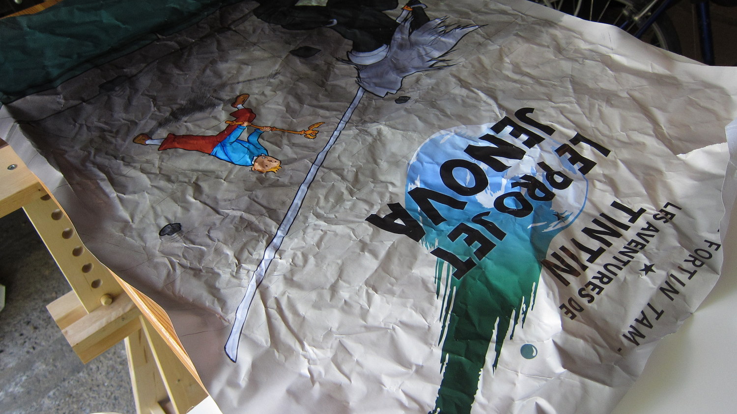
In the process of learning this lesson, I wasted three printed posters and purchased a bunch of equipment (even a wood “canvas” as an alternative to the traditional canvas) for nothing.
Another day, another failed Mod Podge attempt. The printer will start thinking I'm running a TlNTlN bootleg business pic.twitter.com/HHKLFOGE8u
— Jeff 🎆 (@nekohayo) July 3, 2016
In despair, I shelved the project for some months… and lo and behold, in November 2016, Staples lowered their 24×36 canvas printing prices to 100$. Whatsmore, there was an additional 20% rebate I could use, bringing the price down to a laughable 80$. Well, damn. I just ordered the canvas print and was done with it, exactly one year later.
As the old saying goes, there are cases where trying to save money will cost you more. Or, in this rather particular turn of events (where prices plummeted after a year of messing around), exactly the same.
Epilogue
I have now my canvas print on display, and a bunch of blank canvases (and Mod Podge®!) for which I have no use (because I don’t have any more wall space to hang artwork even if I wanted to do traditional painting!)
At least I have a story to tell about this painting.

You can check out my main website, find me on Twitter or Mastodon or subscribe to my YouTube channel.